Friday, April 30, 2010

Living Photographs

I first saw these amazing photographs in an issue of Martha Stewart Living a few years back and they've really enchanted me ever since. Arthur Mole and John Thomas would decide on a composition and then position thousands and thousands of soldiers to fill it in. According to Behind the Photo, "Firstly, they put the outlay (wireframe) of a desired image on a glass plate in Mr. Mole's camera. Then, with help of assistants, the image trace that was seen from the camera, was 'transferred' to the ground beneath the tower. Armed with a megaphone and a long stick with a white flag on it (so it is seen from the distance), Mole was able to show the assistants how and where to plot the curves of the desired image. The preparations for the shoot took several weeks and the actual positioning of people—several hours." What an amazing thing to attempt!
Arthus Mole and John Thomas—Living Photographs
Do you see all of the little guys in there? The liberty bell is made up of 25,000 people and the statue of liberty is 18,000 soldiers - both were shot in 1918. Interesting fact: due to the perspective, 2/3 of the people making up Ms. Liberty are positioned in the torch (roughly 16,000 compared to 2,000 in her entire body). Also interesting, the Statue image was meant to be used in a campaign to sell war bonds but was never actually used.
Arthus Mole and John Thomas—Living Photographs
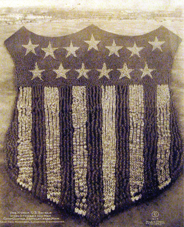
The shield took 30,000 people and was shot in 1918 at Camp Custer in Michigan. I love the barracks in the background. What must these soldiers have thought of this nonsense? From anywhere but a certain above angle they would've looked a complete mess!
Arthus Mole and John Thomas—Living Photographs
These living insignias/emblems were both created in 1919 with the marines emblem (left) taking 9,100 men and the insignia on the right using 10,000. There are a handful more images that have been created such as profile images of Woodrow Wilson, Uncle Sam and American flags. What an amazing achievement this was!

(sources: behind the photo, wikipedia)

Thursday, April 29, 2010

Come Sail Away

It's hard to put into words the beauty of these paper mache boats from artist Ann Wood. They range from being a little spooky to a lot sweet and are all utterly enchanting. Her captures of them only add to the magic.
Boats by Ann Wood
Boats by Ann Wood
Boats by Ann Wood
Aren't they gorgeous? You can't help but imagine yourself sailing into a sunset in one of these creations. What would you take with you? I'd take peanut butter and my collection of Blueprint magazines and my iPod. Oh, and probably all of you that would fit. Let's all take a break and dream of running away from it all shall we? Close your eyes...

Of course, if my house/office/studio looked like Ms. Wood's, I'd feel like I had already escaped the everyday. It's certainly charming and inspiring. These images are from a teeny interview she gave at design*sponge.
Studio/Home of Artist Ann Wood
She was clearly destined to create the magic she does. Her site also shows her amazing birds and other little things she's made. She even has a tutorial on how-to make your own paper mache sail boat. Rainy day project anyone?

Wednesday, April 28, 2010

Better than the Basement

I need fresh air and birds chirping and sun on my shoulders. And working in a concrete basement with zero natural lighting and recycled air does not encourage a pleasant demeanor—especially when it's been so lovely outside! The change in weather has made me squirmy and I've been trying to work outdoors (or at least surrounded by windows) as much as possible. If I worked at the Selgas Cano Architecture office in Madrid I would never feel the itch to get outside. Can you imagine sitting down at your computer every day in this space? All the seasons would be gorgeous—soft snow falling, gorgeous fall foliage, thunderstorms! So amazing.
Selgas Cano Architecture Offices
I love the bright yellow floor and the green wall. And the exposure is just enough to feel surrounded by nature without being super distracting.

Since you and I are probably not going to be lucky enough to work in this office, let's plan our own backyard offices. These are lovely aren't they?
Backyard Office Spaces
(images from Dreamhouse; Chief Home Officer; Home and House Design; Office Pod; and Sunset) I love the idea of heading out to the backyard with a cup of coffee and a macaroon and cozying up to my laptop with the door open and the breeze circling. Girl's gotta dream right?

If you can't get out of the basement, bring a little outdoors in with these great office accessories.
Nature-Inspired Office Supplies
(01): Wood Grain Pencil Cup (02): Potted Green Pencils (03): Tree Silk Pillow (04): Floral File Folders (05): Leaf Mouse Pad (06): Happy Cloud Notepad (07): Sweet Little Miss Sunshine Mug (08): Floral Push Pins (09): Bird Eraser

Tuesday, April 27, 2010

Ms. Heather Chontos

As of late I've become increasingly interested in the occupation of "prop stylist". Once I become "interested" it's only a tip-toe away from becoming an obsession. So I've begun collecting portfolios and am pleased to share some images from a very talented stylist and artist: Heather Chontos.
Heather Chontons Styling
Heather Chontos styling
Heather Chontos for GQ
She plays particularly well with distressed objects and does a great job of layering patterns and textures. Don't you love that woman on the bench? What a fantastic mound of whipped cream hair! And that stunning peony wristband in the first image is the perfect magenta. Heather styled the final set of images for an editorial piece in GQ. Aren't they lovely? I am so happy to see the trend towards making men's fashion spreads more debonair and soft rather than jarring and uber-masculine.

Ms. Chontos is also a talented artist.
Art from Heather Chontos
Don't you love that you can look at the photographs of the shoots she's styled and look at these beautiful pieces of art and see the influence in both? She obviously possesses the ability to bridge many mediums and still maintain her own personal aesthetic sense. Not easily done my friends. And not often done with such elegance.

Visit her online portfolio, blog and feature on design*sponge.

Monday, April 26, 2010

The Circus Is In Town!

I don't know that I've ever actually been to a circus. I think it's a bad idea to start now - it'd be hard for the experience to match the big top in my imagination. So, I think I'll just stick with watching Dumbo and admiring these vintage gorgeous posters.
Vintage Circus Posters
I love the dramatic language and imagery! You can see more posters here and here.

The drama of the circus lends itself well to interior decoration— the colors and patterns and whimsy add such character!
Circus Inspired Housewares
You've got to check out artist Tammy Smith's Homemade Circus (01) website! Her wire sculptures and light fixtures are the perfect mix of Circus creepy and Circus magic. If you want to add just a hint of whimsy, these big top pillows (02) and the gorgeous light grey ottoman (04) are perfect. If you're looking to make a bold statement, the amazing circus print on this curvy chair (03) does the trick. I've loved this anthropologie dresser (05) for quite some time now. The weathered wood and bold graphic typography remind me of crates that would've been used to carry all manner of things needed to pop up a circus. Peanuts (06) are obviously a staple at a circus as well as cheap and sweet snow-cones (07). And you couldn't possibly have a freshly-squeezed lemonade without one of these delightful, striped straws (09). And just for fun, these animal cookie magnets (08) and seal toy (10) are absolutely charming.

Speaking of charming, the following bits of circus-inspired clothes and accessories are fun and fantastical without being overwhelming.
Circus Inspired Clothing
(01): Lovely high-waisted shorts (02): Lion tamer jacket (03): Sweet patterned sundress (04): striped flats with bow (05): quirky top-hat headband (06): black and white striped jumper (07): suspenders (08): black wellies for tromping through the sawdust (09): circus sweets ring

Friday, April 23, 2010

Cardboard Cuteness

My uncle made me such a simple, beautiful little doll house for Christmas when I was 5 and I loved that thing! I remember moving the little people around (which was a mixture of huge Barbie dolls, my brothers GI Joes, She-Ra warriors and actual Little People), playing out the most mundane scenarios: breakfast at the kitchen table followed by washing the dishes, piano lessons, yard work... The doll house looked nothing like my actual house but it was close enough that my little imagination could only go as far as the end of the street.

I wonder what sorts of things I would've dreamed up if this were the house I was given?
Cardboard Castle
Cardboard Castle
Cardboard Castle
I can only imagine that there would've been less breakfast and more dragon taming and magic spells. Maybe one day I'll have the patience to create something like this and I can see what my grown-up imagination is made of. (image via Kris' Color Stripes)

While we're on the subject of cardboard amazingness, check out this furniture.
Cardboard Furniture
I'm particularly fond of the tables and Frank Gehry's side chair. Oh and that Marilyn look-a-like cabinet is so glamorous isn't it? Who knew cardboard could be so chic?

(01 + 02 + 03: David Graas) (04: Miss Julia) (05 + 06: 360see gallery) (07 + 08: Frank Gehry)

Thursday, April 22, 2010

Beautiful Music Together

Show posters have always intrigued me. What the heck do they mean? Why would I relate fish jumping out of a bathtub with Wilco? Or Ray Lamontagne with a spooky house and a Sherlock Holmes look-a-like? Well, I wouldn't... Which is also why I love concert posters: the imagination of the designer is allowed to run wild.
From Dan Stiles
(dan stiles) So often gig posters are printed with muted colors so it's nice to see the bold pink, red and blue. I think the little kid on the chair is hilarious—having his temper-tantrum until he gets what he wants.
From Spike Press
(spike press) I adore that La Roux poster! I've recently become aware of this artist and her hair is such a prominent part of her image, so this poster is a great representation. The Decemberists print does a great job of relaying the romanticism and vintage feel of the band.
From The Small Stakes
(the small stakes) Jason Munn has consistently been my favorite show poster designer. His designs have a delicate, understated quality to them, yet they're so expressive. The She + Him cassette tape is perfect in its minimalism and is so spot-on with the combo of plaid and retro floral design.
From My Associate Cornelius
(my associate cornelius) The designs in this portfolio are so unabashedly retro: from the illustrations to the font choices to the overall feel of each piece. I'm particularly intrigued by the Andrew Bird/Tractor and St. Vincent/Projector poster. What a great idea! And you know what? That banjo playing donkey really looks like Ben Kweller... Ok, it's a bit of a stretch but the cheeks are definitely the same.

Wednesday, April 21, 2010

Portland Designed

I was reading about the Ace Hotel and one of it's original creators, Alex Calderwood in an article in Hospitality Design magazine. In the article he's asked to name a "space he loves" and his answer was the Wieden + Kennedy Ad Agency in Portland. Since his Hotels are spaces I love, I assumed I'd also be inspired by his selection. Obviously.
Wieden and Kennedy Ad Agency: Portland, OR
The space itself is so perfectly Oregon to me— all wood and windows and open spaces. Who wouldn't love to work at an agency that offers a hammock overlooking forests and mountains? As absolutely glorious as the above pictures are, it's actually these two wall messages that I'm completely enamored with.
Wieden and Kennedy Ad Agency: Portland, OR
The top image is made completely out of pencils (those are the erasers you see) and the "Fail Harder" quote is clear thumbtacks. Genius, right? (PS: this agency is responsible for those hilarious Old Spice commercials ["did you know that I'm riding this horse backwards?"] as well as the crazy Target lady commercials from Christmas. Check out the site to see what else they've done.)

Another awesome Portland design workspace is the Parliament offices. They've completely transformed their office with custom "collab" tables and amazing firewood wall treatments. Not to mention their beautiful seating arrangements and art (check out that moustache!). See for yourself.
Parliament Design: Portland, OR
Check out their impressive portfolio too.

Tuesday, April 20, 2010

Aces

Close to a year ago I was introduced to Ace Hotel in Portland, Oregon and it's intrigued me ever since. I have this strange obsession with Portland. I say strange because I've never visited nor do I really know anything about it. But as far as I'm concerned it's amazing and beautiful and a city I aspire to live in. Well, it's at least a city I aspire to visit. And in my dreams, I'm staying at this beautiful hotel.
Ace Hotel: Portland, OR
There's a photo booth in the lobby! And green stools! And beautiful tile and wood paneling and a huge community coffee table! What's more charming? Maybe the rooms? Yes...
Ace Hotel: Portland, OR
Of course all of the rooms have individual personality and charm—no generic, itchy floral bedspreads or particleboard tv cabinets or poor man's Monet paintings hanging crookedly over the beds. Just gorgeous wall decals and beautifully designed blankets and a heavenly amount of white. This particular Ace Hotel (there are four all over the country) takes pride in the fact that they've employed local artists to stock the renovated historic hotel with creative and unique pieces. Also, they've made it a point to use a respectable amount of recycled materials in their design. AND it's not crazy expensive to stay (rooms range from $95 to $250 a night).

The Official Manufacturing Company
is comprised of a few guys that separately worked for Wieden + Kennedy (stay tuned for more from them tomorrow) and Ace Hotel along with various freelance jobs. Their portfolio includes designs for Ace Hotel: stationery, a gift belt for "sleeping with us", camp badges and other great pieces. Isn't their logo great too? Check out the rest of their portfolio and blog.
Official Manufacturing Company: Portland, OR
If you're anywhere near an Ace Hotel, do yourself a favor and, at the very least, wander in and be inspired. If you're like me and nowhere near one, get your plane ticket asap.

Monday, April 19, 2010

Modern Art

Are you familiar with a website called "missed connections"? Well, me either really, but I am familiar with these illustrations from artist Sophie Blackall. She's an Australian illustrator who now resides in Brooklyn where she (among other things) peruses the "missed connections" website and creates these hilarious, endearing, sometimes melancholy interpretations.
Sophie Blackall
Left: "You had a guitar. I had a blue hat. We exchanged glances and smiles on the subway platform. I pretended to ready my New Yorker but I couldn't concentrate. You got on the Q and I stayed on to wait for the B. You were lovely." Right: "Not only did you introduce me to the wonderful world of knitting, I quickly found myself smitten with you after chatting for a few minutes. Despite you mentioning you had a boyfriend, I can only hope he is terminally ill so that I'll get a shot at knitting something for you one day. You were one of the warmest people I've met on a subway at 2am, and a reminder why I love this city."
Sophie Blackall
Right: "Phoenix with crutches— I would love to carry you around piggy back until you can walk again." Left: "I bought you that milkshake. You just didn't realize it."

These are my two favorites:
Sophie Blackall
Right: "Scrabble Tattoo on Roof— asked myself why the letter 'n' all night long, then you were gone before i got a chance to ask. also, i saved you a piece of cake. do you always sit in a circle of asian girls? and sit at the top of the stairs so everyone gets a crush on you when they get to the roof?" Left: "Throat Tattoo— Hey guy that got on at 1st avenue dressed all in black with the throat tattoo. Thanx for existing."

Aren't they so great? You can look at more on her website and actually purchase some at her etsy store.

Another fun, artistic interpretation of some of our modern-day ways to connect are these "spam one-liners" from artist Linzie Hunter. Her hand-drawn type lends charm and wit to these silly messages. ("One day the tooth fairy may save your child's life"?)
Linzie Hunter
You can check out others on her Flickr page or visit her website to see more of her amazing work.

Friday, April 16, 2010

A Splash of Yellow

I was recently introduced to a talented artist who goes by the name "Kris Atomic". Her illustrations are so completely charming and fun—I want to wallpaper my kitchen with them! Spring always rekindles my attraction to yellow and when I found these paintings of hers with a strong yellow base, I knew I'd found today's post.
art from Kris Atomic
Aren't you smitten? The top little lady is so fabulous with her belted cardigan and pretty little bow in her hair. And that bike! Nothing sighs spring like a basket of flowers on a bold red bike. And sweet yellow striped tights under a baby blue dress? So perfect! Those three little women are so stylish and friendly aren't they? They're all flouncy skirts and cotton candy hair. You've got to check out Kristina's blog!

Want a little yellow to brighten up your April? Me too! Let's get one (or so) of these goodies...
Darling yellow
(01): Apron from Anthropologie (where else?!) (02): Pride + Prejudice (03): Cupcake Pincushion (04): Le Creuset French Oven (05): Floral Sofa (06): Cleo Chair (07): Retro Phone (08): Teapot (09): Lamp (10): Round Rug (11): Whisk

Have a lovely weekend— hope it's sunny!

Thursday, April 15, 2010

Keepin' It Clean

I am lucky enough to live in my father's childhood home — a sweet little two-bedroom house on about an acre of land located just far enough outside of the city. There are many things that I really love about the space: the sun porch with tons of light, the lilac bushes outside my kitchen window, the beautiful aqua sink and tub in the tiny bathroom... But there are a few things that I'm not crazy about: the lack of closet space, minimal counter tops and the absolutely ancient, avocado-colored washer and dryer. I know I shouldn't complain, they do work just fine and it sure beats the laundromat, but I do find myself daydreaming on occasion (usually when I've been waiting for my clothes to dry for two hours) of a charming laundry room. A room with ample storage, a drop-down ironing board and lots of natural light. You know, something like this...
Laundry Rooms
Laundry Rooms
*Images from— (row 1) simply grove/linen cupboard (row 2) stagetecture/country living (row 3) decorpad/simply grove (row 4) simplygrove/digsdigs*
I love the idea of putting your sewing area and a work desk in the laundry room too. If you were talented enough to be able to tailor or mend or sew a button back on, it'd be nice to have a dedicated area to do that sort of thing.

If you're like me and this sort of laundry room isn't really in the cards for you right now, why not bring a little bit of beauty to the room with these charming detergents? You could always make your own and store it in an elegant glass jar or other lovely container... or get your debit card out and order one of these beauties.
Laundry Detergents
(01): JR Watkins (02): The Laundress (03): Charlie's Soap (04): Town Talk Polish (05): B_E_E (06): Mrs. Meyers (I've also seen this at Target) (07): Maison Belle (08): Art Home

Wednesday, April 14, 2010

A (Lovely) Education

Have you seen An Education yet? It was really quite lovely to watch— the costumes, colors and set design was quite nice. The story was difficult to watch at times but I was always comforted by the beauty of the visuals. See what I mean? Her dress is like a painting and his tie clip and camera are just so darn dapper.
An Education Movie Still
I love this shot of Carey Mulligan and that cutie Dominic Cooper doing a little dance - her cream dress with that pop of red on the shoulder is stunning. I love the ladies with the car too: Rosamund Pike's leopard coat and Ms. Mulligan's leopard hat is such a good idea!
An Education Movie Stills
The top left image (below) was used in the movie poster and you can definitely see why— it's breathtaking. Everything is so delicate: their expressions, the touching, the sweet red handkerchief on the stones. I love that so many of the fabric patterns from this era could've been made into a dress or upholstery or curtains— wouldn't her blue and green hydrangea dress make a gorgeous chair? Oh! And that shot of Carey in front of the pantry is so beautiful. The muted wallpaper and her school uniform to the right of that perfectly organized pantry is so charming.
An Education Movie Stills
(all images copyright Sony Pictures Classic via ace showbiz)
To wrap things up I thought I'd share some of the album covers from the soundtrack, just to give another glimpse of the time period. I love a good mix and this one doesn't disappoint. Be sure to listen to Mademoiselle Grecco while wearing your fake eyelashes and drinking a glass of wine.
Record Covers
(All albums and images from Amazon—the soundtrack can be found there too.)

Tuesday, April 13, 2010

Lady Sings the Blues

On my way into work yesterday morning I heard a great interview with Peter Wolf on NPR. He was the lead singer of the J. Geils Band for nearly a decade and has since had a successful solo career. To be honest, I wasn't super familiar with him but I was so intrigued by his stories. I love to hear musicians talk about their travels and the people they've met and their crazy, mixed-up backgrounds. It's as if they've lived three or four times over. That's one thing I love about NPR, their storytelling is so vivid that I feel like these memories are my own.
I particularly loved Peter's stories about his meeting Muddy Waters at a coffee shop in Boston. He was only 17 and yet somehow managed to not only hang out with the band one random afternoon but magically his apartment turned into a hang-out for not only Muddy Waters and the band but John Lee Hooker and Howlin' Wolf. I can't even imagine how amazing that was! His description of how impeccably dressed these men were really got me thinking about that time and those beautiful men and women. Some of these images are from before Peter's time, but they are all of great Blues musicians.
Great men of the Blues
Lady Sings the Blues
More Great Blues Men
Clockwise from top, far right: Howlin' Wolf, T-Bone Walker, Victoria Spivey, Lead Belly, John Lee Hooker, Big Joe Turner, Buddy Guy, Billie Holiday, Ray Charles and BB King. Aren't they beautiful? Really take your time and look at these talents - their expressions and personal style and environments are so inspiring to me.

Want to get that bluesy sensibility for yourself? Here's some help:
For gentlemen:
Blues: Men
(01): Plaid Blazer from Marc Jacobs (02): Honeycomb flask (03): Houndstooth patterned guitar strap (04): A nice Cuban cigar (05): Saddle Shoes from JCrew (06): Gorgeous guitar

For ladies:
Blues: women
(01): Sophisticated sheath from Donna Karen (02): Vintage Hat (03): Sweet pink Trumpet (04): Steel Grey Pumps with Charming Bows (05): Faux-Fur Collared Coat (06): Flower Hair Pins
Related Posts Plugin for WordPress, Blogger...