Monday, May 31, 2010

Picnic Season

Memorial Day is the official (well, unofficial actually) start to Summer and what better way to celebrate the season than with a picnic? Get a group or your boyfriend/girlfriend or just get on your bike and head out to a shady area.
Picnic
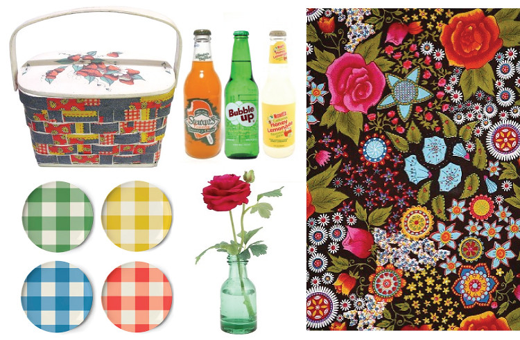
I love this vintage 1970s image from House and Garden magazine. It's so whimsical and lovely. I wish I could tell you where the images on the far right came from, but your guess is as good as mine. I'm pretty sure the darling couple came from Once Wed, but the charming young woman could be from anywhere. I'll let you know if I figure it out! (found her!)
Picnic
Vintage picnic basket from Etsy seller plaidpony // fun and delicious sodas // eclectic tapestry from Urban Outfitters // melamine dishes from the Curiosity Shop // bud vase from Urban

Friday, May 28, 2010

Edward Hopper

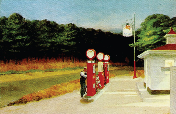
I have a little summer fling every year with Edward Hopper. His work is so quiet and soulful and melancholy and his depictions of mostly coastal, mostly small town life resonates in an indescribable place within me.
Edward Hopper
Edward Hopper
Edward Hopper
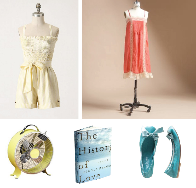
Can't you just feel the heat and the breeze? It makes me want to put on a flowy nightgown and sip iced tea and lay in front of a fan.
Edward Hopper Inspired
Cream jumper // Berry Nightgown // yellow retro fan // The History of Love by Nicole Krauss // turquoise ballet flats

Thursday, May 27, 2010

Paul Octavious

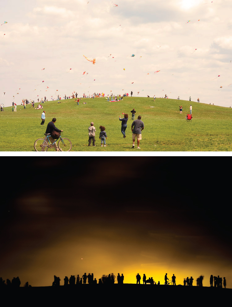
For two years, Paul Octavious has been visiting this mound of earth and documenting what he's seen. I love the idea of recording the life of a hill—it's very Giving Tree-ish. What did the hill give up for us so that we could fly a kite or play soccer or go sledding? The earth turns into a character in the story instead of being the setting. I think if we're lucky, we all have a tree/river/hill that's more of a supporting cast member than a place in the story of our lives. What's yours?
Same Hill, DIfferent Day
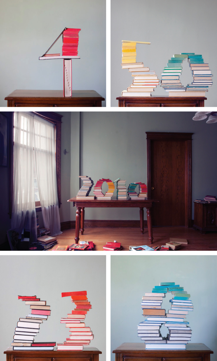
Paul also has a handful of other projects on his site. Another one that I was particularly drawn to was "The Book Collection" in which he arranged books to form mostly numbers. There's something about the way he did it that is very moody to me. The photograph itself has a vintage feel and his choices regarding the color and succession of the books is quite well done. The books become a whole as opposed to individual objects.
Paul Octavious
Visit his site for other projects.

Wednesday, May 26, 2010

We All Scream!

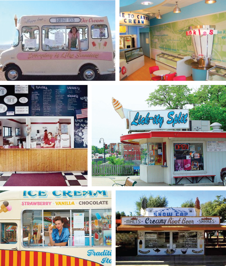
It has been unseasonably (and gloriously) hot here the past few days which has flung me into all things summer. And nothing says "summer days" better than ice cream. And what says "ice cream" better than vintage advertisements and retro ice cream trucks and parlours?
Ice Cream Ads
Isn't that Meadow Gold girl the sweetest? Her pigtails are to die for. And that cardigan! I bet Anthropologie has one for me. The Fudgi Frost ad is also darling with its happy family and "save bags for swell gifts". (aside: if you give me the bag, there darn well better be a fudgi frost in it or we're going to have words) Apparently my problem in the romance department has been that I don't make enough "seven-up floats". I think I'll set up a stand and see if these cuties find me. And, of course, Dairy Queen—I don't have to say anything about it because we all have fond memories. What's your favorite DQ treat?
Ice Cream
If I saw that pink ice cream truck cruising down my street I'd be the first kid to drop my jump rope, strap on my roller skates and set off. I'd definitely be ordering a Good Humour strawberry shortcake ice cream bar. The interior of this famous Carvel parlour is so fun! Love those pink chairs. I'm crazy about chalkboard paint and it's especially great in a restaurant with talented kids creating a handwritten menu! The Lick-ity Split reminds me of a booth at a fair. And the googly eyes on their cone mascot is hilarious. This little lady in her silky blue top is just about the cutest thing ever. Don't you feel like her name is Betsy? She's for sure got some ice cream tales to tell. And a cigarette to share. Finally, the Snow Cap stand looks straight out of a movie doesn't it? Super charming.
Ice Cream
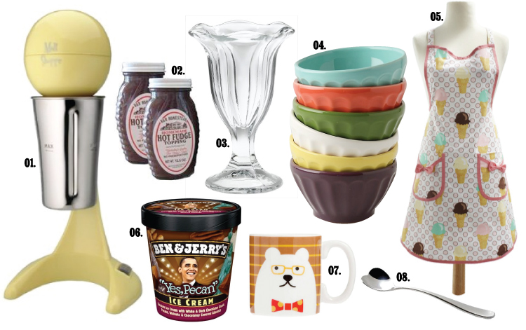
Let's make our own ice cream parlour! Retro Milkshake Maker (01) // Wisconsin-made Hot Fudge topping (02) // Classic sundae glass (03) // lovely ice cream bowls (04) // charming ice cream cone apron (05) // my favorite! "yes pecan" obama limited edition ice cream (06) // because I prefer my ice cream in a mug: smarty polar bear in a bow tie cup (07) // heart-shaped float spoon (08)

Let's all pile into the station wagon and get some soft serve!

Tuesday, May 25, 2010

Thanks!

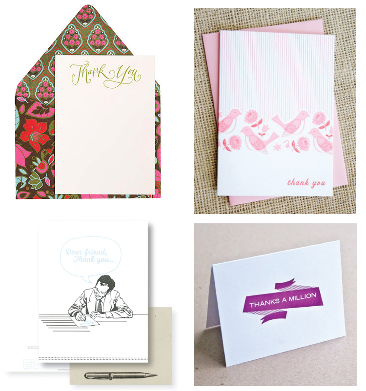
Writing thank you notes (promptly) is such a discipline. I always have the best of intentions every time I receive a gift or have a particularly good conversation or dinner with friends, but more often than not the time passes and I don't send the little note I wanted to. It really is a shame. Who doesn't love a piece of mail that has absolutely nothing to do with your bank account? And wouldn't it be such fun to get one of these beauties? Let's try harder to thank those that deserve it shall we?
Thank You Notes
(top row: rifle design; bottom left: fine day press; bottom right: hello lucky)
Thank You Notes
(top left: paper source; top right: hello lucky; bottom left: oddball press; bottom right: igloo letterpress)

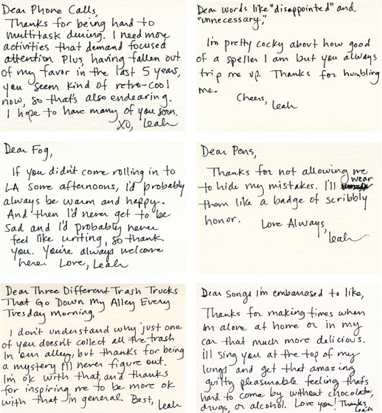
Leah Dietrich has decided to write a thank you note (nearly) every day to anything she's grateful to or for. Sometimes it's a stranger, sometimes a flower, sometimes an abstract idea. They are hilarious and fun and occasionally a little melancholy. Here are a few of my favorites:
thx thx thx
There are loads. Check them out on her site.
(I'm thankful for you)

Monday, May 24, 2010

Guerrilla Gardening

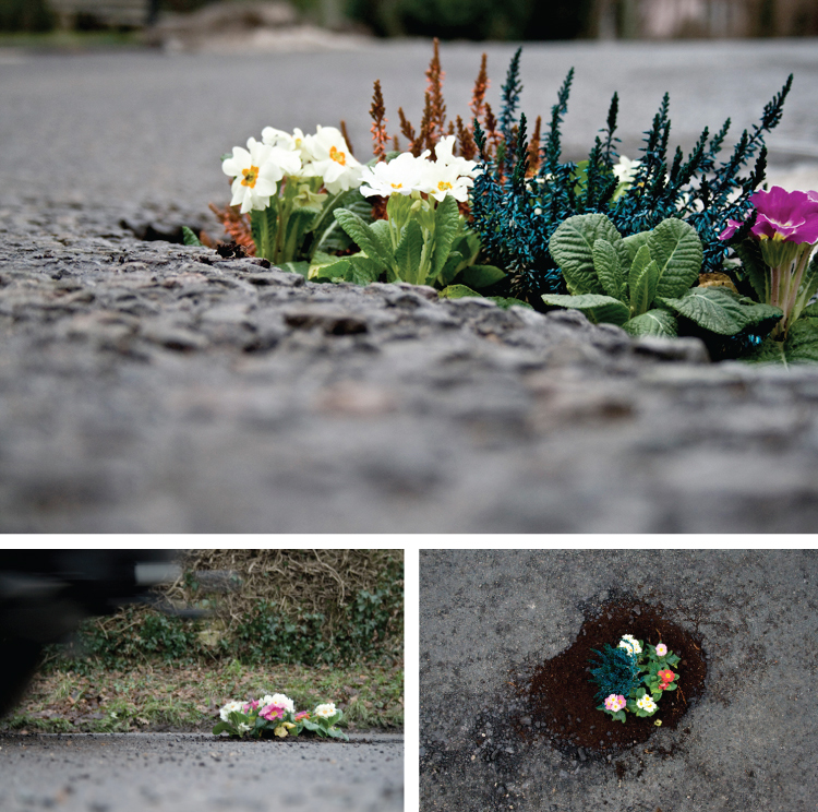
Cup of Joe introduced me to Pete Dungey late last week. He's a design student in London who's taken it upon himself to fill potholes in Britain with these lovely gardens. As so much art is, this is not just lovely it's also a social commentary. In this case it's meant to highlight the problem of surface imperfections on the roads.
Pete Dungey: pothole gardens
Aren't they cheery? On his site he's encouraged people to plant their own pothole gardens as a sort of group art project. There are some monster potholes in the parking lot at my work that would benefit greatly from a pansy or two.
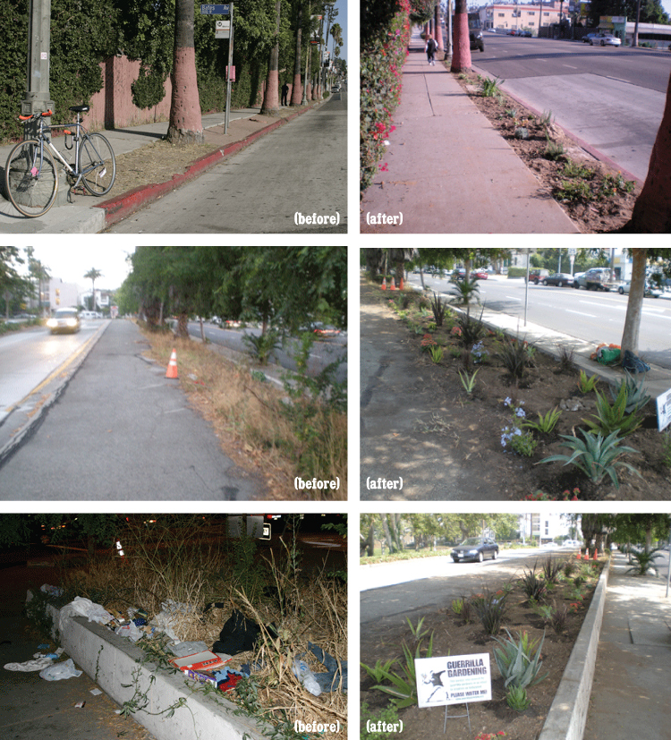
As I began to research Mr. Dungey, I was introduced to the topic of "guerrilla gardening". Throughout the world there are groups of people taking it upon themselves to plant flowers or produce in mostly public spaces. Wikipedia has a great explanation of it with links to a handful of other sites where you can familiarize yourself with the different groups. The Los Angeles Guerrilla Gardeners had some great before and after shots of their projects.
Guerrilla Gardening in LA
Isn't that great? What a cool idea.

Friday, May 21, 2010

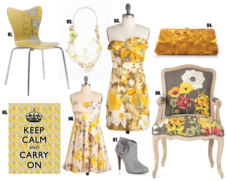
Yellow and Grey Garden

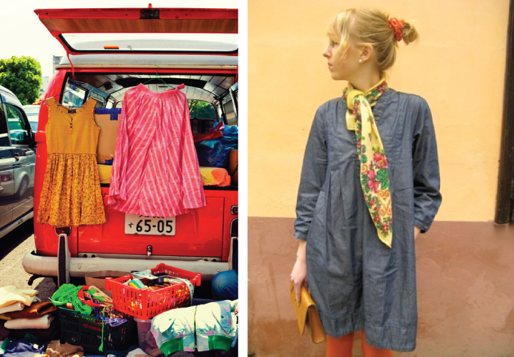
There are a handful of blogs that I visit that showcase "real" people being fashionable. (I say "real" because they all could be models) I ran across these four shots and thought they were so Springy and lovely.
Grey and Yellow Fashion
I love the yellow and grey. It's such an interesting combination. If you said it out loud to someone they may not get it, but when you show them how gorgeous you are, they wish they'd thought of it. (sources, clockwise from top right: The Sartorialist, Alice Point, The Sartorialist, Chictopia) A sweet friend of mine combined yellow and grey/violet and red for her wedding and it was so fun. (Her pictures are amazing! Click the link.)
Grey and Yellow Fashion, Interiors
01: West Elm// 02: Anthropologie // 03 + 06: Mod Cloth // 04: JCrew // 05: Etsy // 07: BCBG //08: Anthropologie

Thursday, May 20, 2010

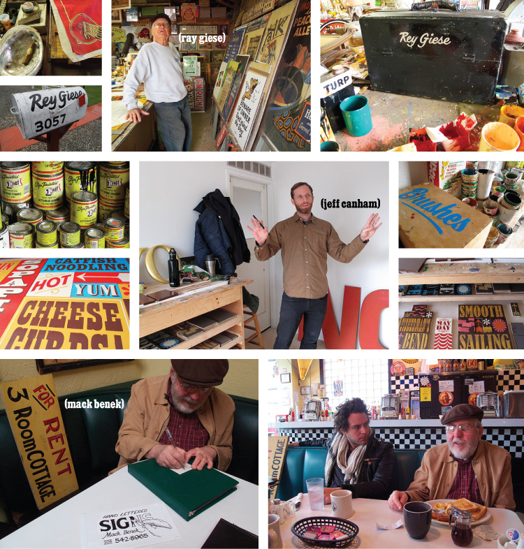
Sign Painters

I have always been attracted to hand painted signs. Even the not-so-well-done ones. There's something about handmade that is so endearing and important. Luckily, I'm not the only one that believes this (I think there are lots of us and only growing). Sam Macon and Faythe Levine have recently begun traveling the country documenting men and women still involved in the art of hand lettering signs. They haven't been in production for very long so I'm afraid we'll have to wait quite a while before this is actually available to watch. But, they're doing an excellent job of blogging about their travels and they have a lovely Flickr photostream. I'm very excited to keep up with their progress!
"The Sign Painter" Movie
I hope you can see all of the intrigue on this page! The artists and their space and their work is just so inspiring. I'm particularly interested in the interview with Ray Giese. He's been painting signs since he was 20 (70! years ago) and still does it. It's amazing how even in a photograph you can just tell that he's got some stories to tell and some wisdom to teach. Be sure to check out the blog and photostream for even more great images and information.

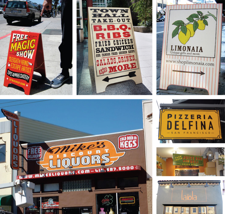
The last strip in the above collection is New Bohemia Signs based in San Francisco. They are a busy little group and do excellent work. I decided to showcase them specifically because they have a gorgeous online portfolio and website and because they reminded me that sign painting doesn't have to be retro in style. They do a beautiful job with modern typography and simple layouts as well as the more traditional painting.
New Bohemia Signs
Now, go into your community and appreciate your sign artists.

Wednesday, May 19, 2010

Orange + Black

I found this amazingly sweet ampersand by artist Gemma Correll and simply had to share it with you.
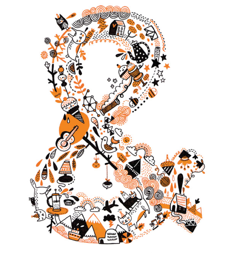
Ampersand by Gemma Correll
Isn't it amazing? This thing has everything cute in the world: cats in birthday hats, houses with hearts, contented ice cream cones, yarn, cupcakes, rabbits napping with carrots... What's your favorite?
Since that isn't enough for a whole day's post, I thought we could talk about orange and black. Often the two colors together tend to look a little two Halloweeny for me, but apart they're modern and classic and loads of fun.
Gingham is super summery, and since it's finally getting warm here, it's a completely appropriate pattern to talk about. Look at all of these gorgeous black and white gingham goodies.
Black!
You would look so great in that floppy beach hat (01)— it's very Jackie O, don't you think? And for all of the male readers (or females with gorgeous, style-savvy men in their lives) you would be so dreamy in the button-down (02) or bow-tie (05). The belted, strapless dress (03) is so simple and elegant—you could wear it to a garden wedding or a picnic. I adore a fun umbrella (04) and this beauty, with it's ruffled trim would bring a smile to my face on the gloomiest of days. Finally, if you're just looking for a hint of gingham to jazz up your outfit, this heeled shoe (06) with it's sweet little bow or the flirty gingham flower (07) are the perfect accessories.
Now on to orange! Something about orange begs to be a fun polka dot or stripe, so that's what I've decided to focus on in this board.
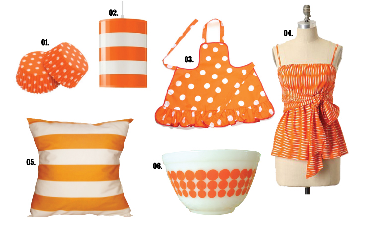
Orange!
The kitchen is a perfect place for a bit of orange. It's cheery and lively and in small doses, not at all obnoxious. I can just see you (at age 5, since it's pint-sized) in that ruffled apron (02) mixing batter in that vintage pyrex bowl (06), with the dotted cupcake liners (01) waiting to be filled. You're adorable! The grown-up you is lovely in this striped top (04), lounging on a linen couch with this striped pillow (05), under the striped pendant (02). Ok, it's a bit much all together, but as accents: glorious.

Tuesday, May 18, 2010

Le Petit Bateau

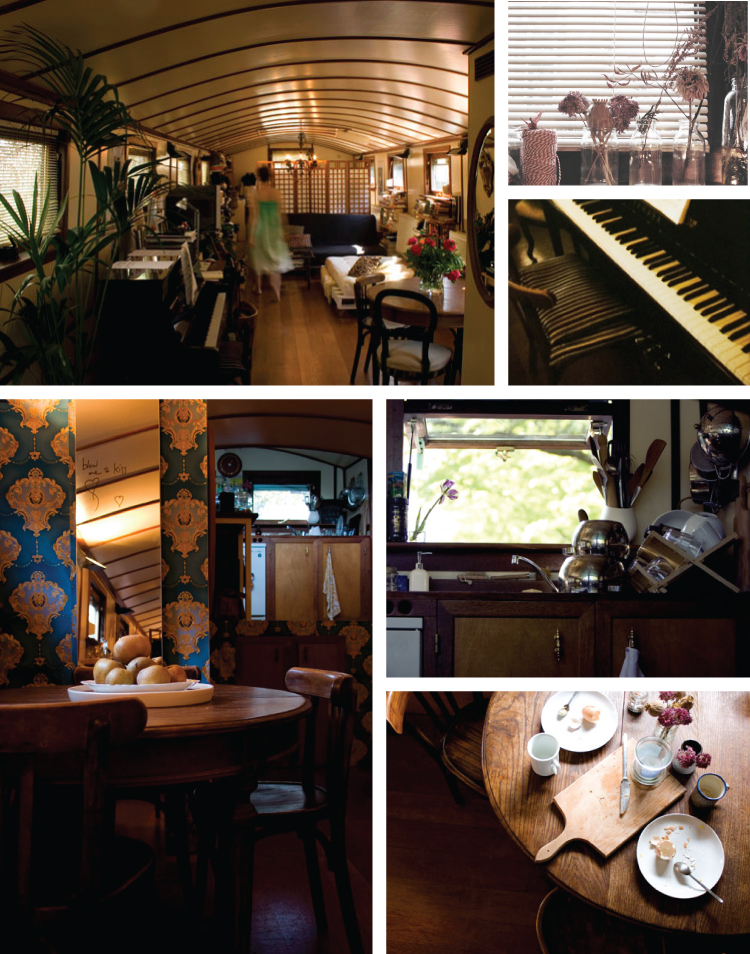
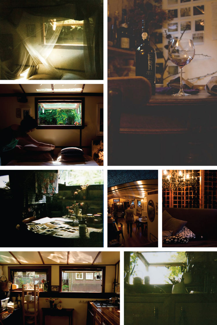
My brother and his lovely wife honeymooned all over Europe— they took some amazing photographs, one of which was of a houseboat in Holland. I was really enchanted by it. It's such a charming and romantic idea: to live on a houseboat tied to the land but separate from it. I'm not sure how my stomach would do with all of that bobbing, but if my houseboat looked anything like the lovely Pia Jane Bijerk's, I'd definitely be willing to give it a try!
Pia Jane Bijerk Houseboat
The lovely Ms. Pia Jane is a prop stylist, which explains the gorgeous photographs. She and her boyfriend moved from Paris to Amsterdam and are renting this space. The owner built pieces of furniture specifically for the boat (shelves, bedside tables, a computer desk) and was completely passionate about every detail. I love the bedroom with it's gauzy curtains and high windows. Can you imagine laying there in the early mornings listening to the rain hit the water or enjoying the ducks splashing around? I'm not sure I could do it long-term, but I think it'd be a charming vacation space.
Pia Jane Bijerk Houseboat
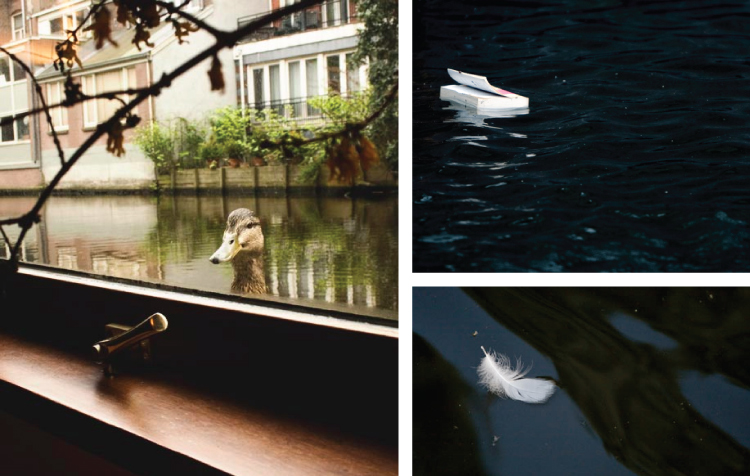
Love these shots Pia took of things floating by her window. That duck is hilarious! The only thing that floats by my window is dandelion fluff. Books are much more exciting!

Monday, May 17, 2010

Modern Stitchery

I love embroidery. I love the hoops and the beautiful colored floss and the fact that you can embroider absolutely anything. I've seen a lot of embroidered baby clothes and pillows and lovely handkerchiefs, but when I came across these beauties I was so excited!
Embroidery by marysgrandaughter
These mixed media pieces are so charming and fun. I especially love the acrobats and the funny little badges. Isn't that little guy in the scarf and antlers sweet? What do you suppose he's up to?
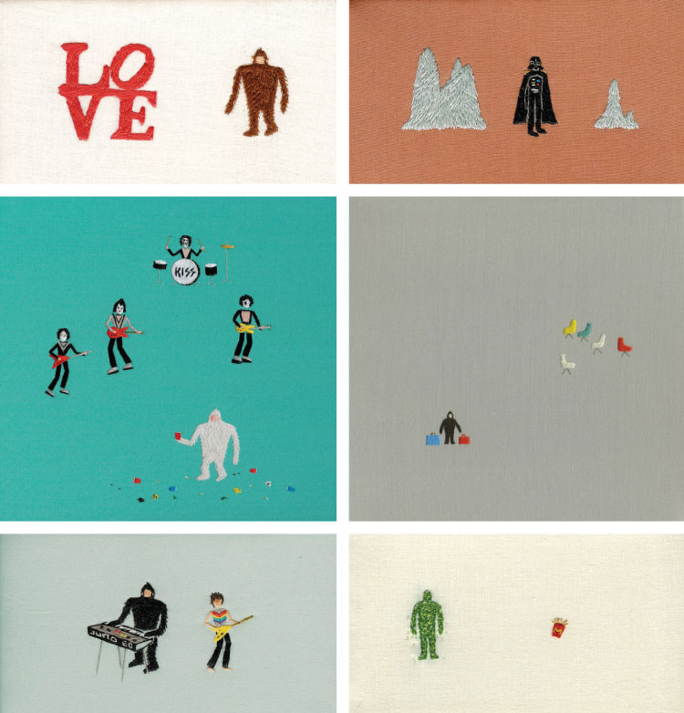
Embroidery by Megan Whitmarsh
Megan Whitmarsh and her embroidered yetis, band members and darth vader (oh, and those french fries) are really amazing, don't you think? The colors are beautiful and the subject matter is really hilarious. She really does a nice job with her stitchery and composition—clearly a very talented artist!
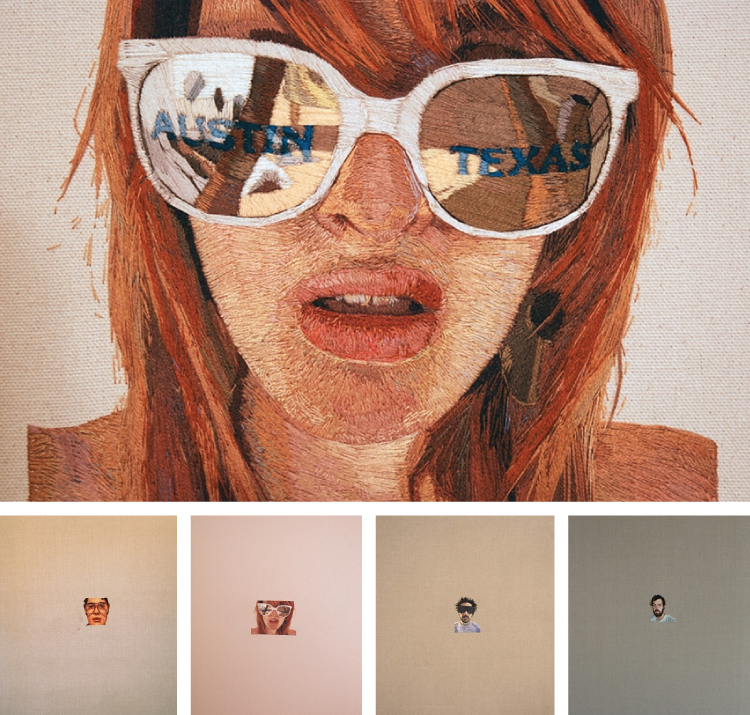
Embroidered Portraits by Kornrumpf
Speaking of talented artists, can you believe these portraits by Daniel Kornrumpf? They're really breathtaking. I can't even imagine the patience it'd take to make them. And when you think about how small the portraits are and how tiny the stitches have to be it's even more amazing.
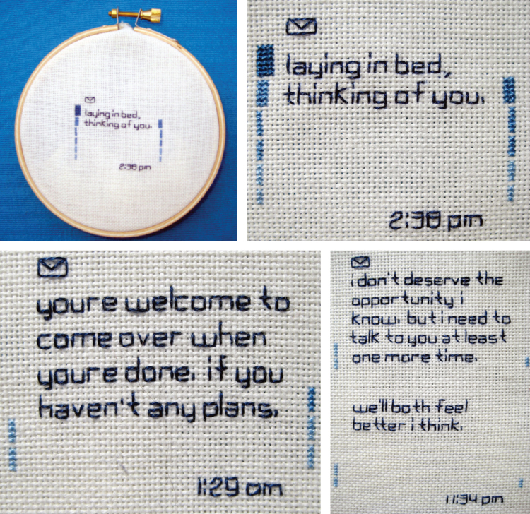
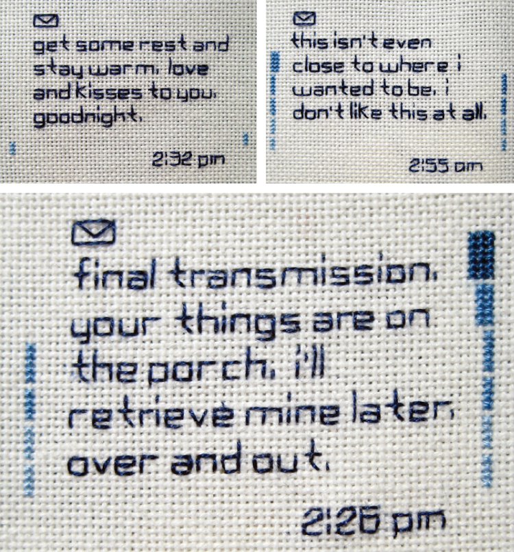
Embroidery by Ginger Anyhow
Finally, compared to the difficulty level of the previous three artist, these "texts" from artist Ginger Anyhow might not be quite as impressive. BUT. They are just as endearing—maybe even more so for me. I love little, emotional quips and these are just so great. Such a fun (and perhaps a little heartbreaking) way to exemplify our modern communication.

Friday, May 14, 2010

Another Talented Stylist

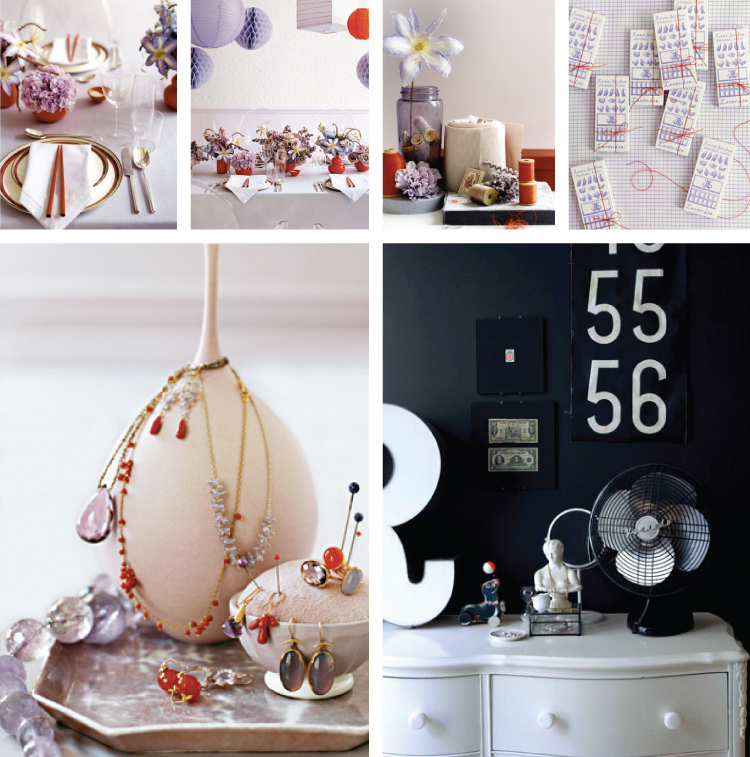
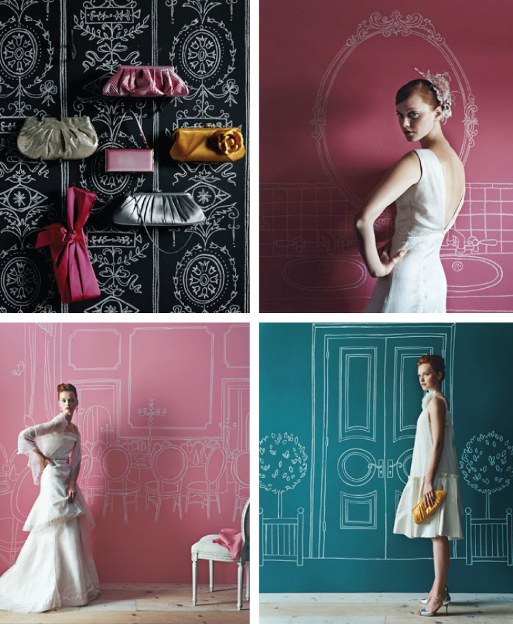
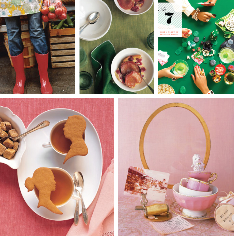
If you've picked up an issue of Martha Stewart Weddings in the past few years, you're probably familiar with Randi Brookman-Harris and you didn't even know it. Randi has been a prop stylist since 2003 and since then has worked for Martha, Kate Spade, J Crew and others. Since deciding to work on a freelance basis she has worked for Paper + Cup and Real Simple and her list of clients is rapidly growing.
Styling by Randi Brookman Harris
Her background is in graphic design and she has a degree from the School of Visual Arts. She has a wonderful sense of balance and control—her designs are put-together but not so polished that they feel forced or too poised. She has an incredible master of color and texture and does a nice job of adding a touch of whimsy. She seems to not take herself or her creations too seriously. (Notice the fanciful chickens in the J. Crew shoot or the seal toy on the dresser.) I love that she often brings in an element of hand-made to her images: the drawings on the wall, a hand-written note.

I had the pleasure of speaking with Randi over the phone and she is absolutely lovely. Charming and intelligent and full of passion for her chosen profession. Oh, and she's adorable.
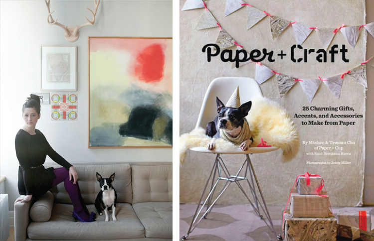
Randi Brookman Harris
That's her on the right sitting on the arm of her couch with her dog, Olive (who is a star in her own right). Pop over to A Little Sussy to read a great interview with Randi and then visit her website and blog for even more amazing designs.

Thursday, May 13, 2010

I Made You Something

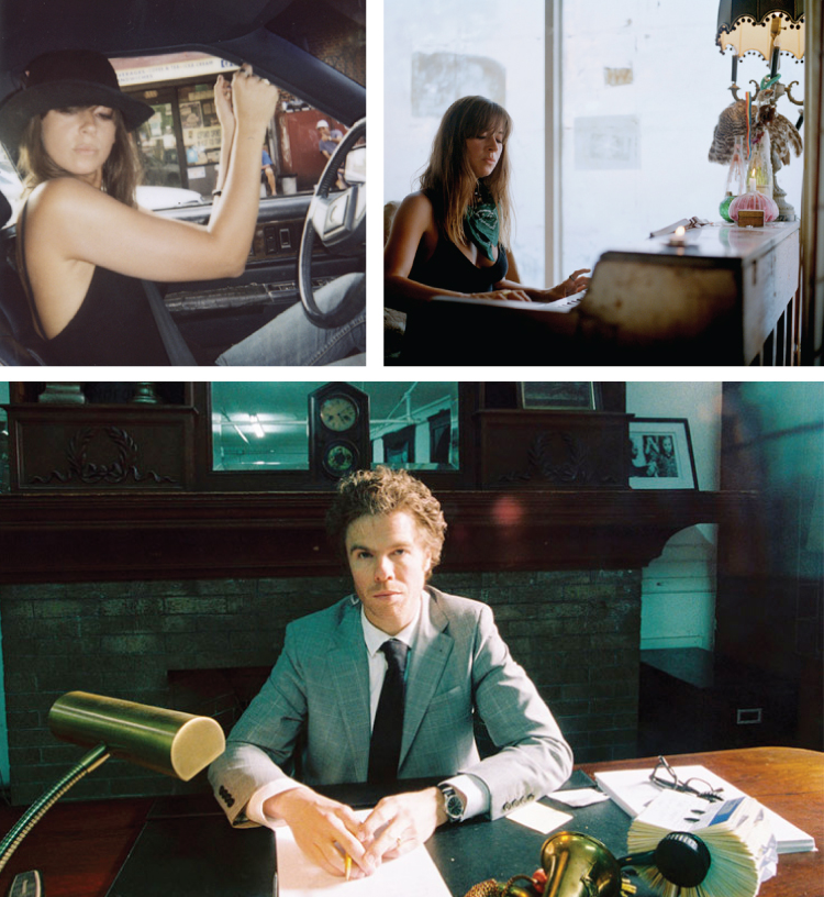
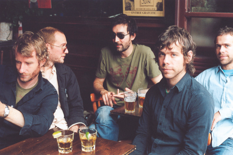
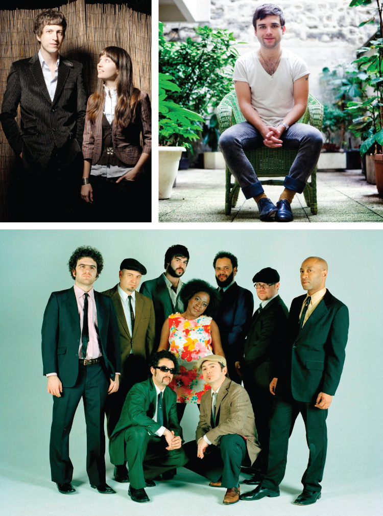
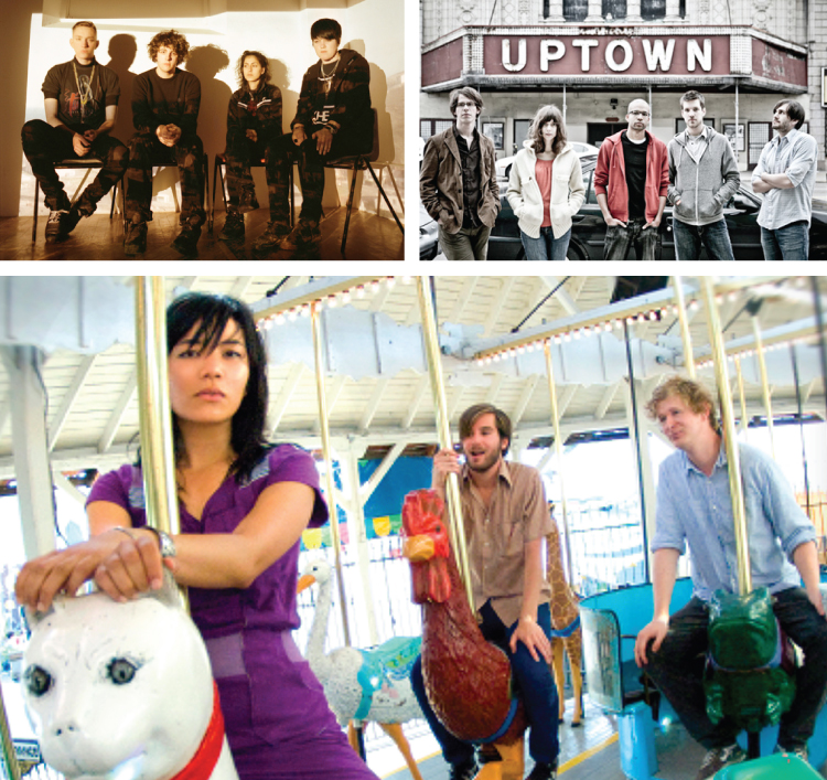
Boy are you in for a treat today! I've made you a lovely visual mix tape and I couldn't be more excited to share it! I've been very lucky lately and some dear, dear friends of mine have gifted me with some new music. Most of which I'd never heard of. Even luckier—they really know me and the music is exactly my taste and it's really helped to soothe my Spring fever. First, take a look at their lovely faces. Then, click on the You Tube links at the bottom to hear and view these sweet treats.
Cat Power + Josh Ritter
The National
She and Him + Beach House
Tallest Man on Earth + Elvis Perkins
Wooden Birds + Chris Garneau + Sharon Jones and the Dap Kings
The XX + Scattered Trees + Thao and the Get Down Stay Down
Hard to believe there's so much beauty and talent in the world huh? You haven't even begun to experience this post yet. The artists are listed from top to bottom (the first two images are of the same band but the rest only have one image each. I have a girl crush on Chan Marshall so she gets two spots. Can you blame me?).

No. 1: Cat Power—Lived in Bars // No. 2: Josh Ritter—Change of Time
No. 3: The National— Terrible Love // No. 4: She + Him— In the Sun
No. 5: Beach House— Zebra // No. 6: The Tallest Man on Earth— I Won't be Found (+ more)
No. 7: Elvis Perkins— Shampoo // No. 8: The Wooden Birds— Anna Paula
No. 9: Chris Garneau— Hands on the Radio
No. 10: Sharon Jones + the Dap Kings— 100 Days, 100 Nights // No.11: The XX— Crystalised
No. 12: Scattered Trees: A Conversation About Death on New Year's Eve Note: You can download this AMAZING album for FREE here
No. 13: Thao + the Get Down Stay Down— When We Swam

I hope you feel the love I've sent you with this little mix tape. It's overflowing!

Photo credits:
Cat Power (left, right) // Josh Ritter // the National // She + Him // Beach House // the Tallest Man on Earth // Elvis Perkins // the Wooden Birds // Chris Garneau // Sharon Jones + the Dap Kings // the XX // Scattered Trees // Thao + the Get Down Stay Down

Wednesday, May 12, 2010

Fashion Styling

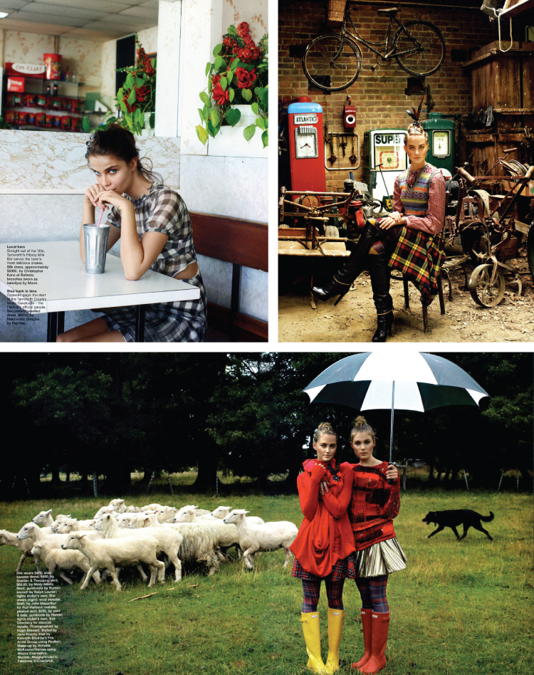
When I'm browsing through a catalog or a look book or magazine, the styling of the photograph is the most intriguing thing to me. The fashion itself could be something I'd never even consider wearing, but if the space is designed well and interestingly, I'm immediately drawn in.
Styling by Jane Roarty
These photographs (styled by Jane Roarty) are so rich and lovely. The use of the mirror in the top left to bring in a little more red and texture is such a good idea. The posture and poise of the woman in the garage is such a contrast to the chaos of the space and yet it seems as though she should be sitting there for all time. The bottom shot of the two rainy day girls is so much fun. The stylist could've easily left the background to just the lush green, but by adding the sheep and sheepdog a whole other level of intrigue and life is added. The photographer captured it perfectly by framing the two ladies with the sheep on one side and the dog on the other.
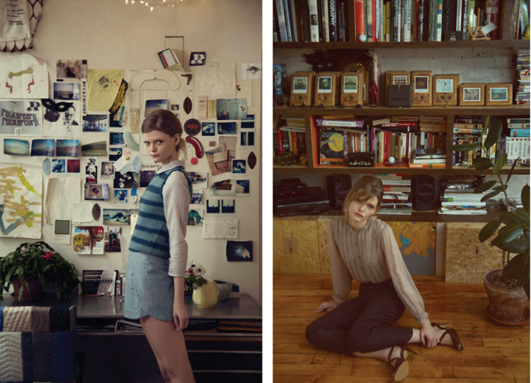
Lyell Clothing
I am in love with the styling in these two shots from Lyell. It's as if this woman has opened her apartment to us and we've just popped in for a cup of tea and a photograph or two. The casualness and timelessness of the fashion is mirrored effortlessly in the space. And how adorable is she?
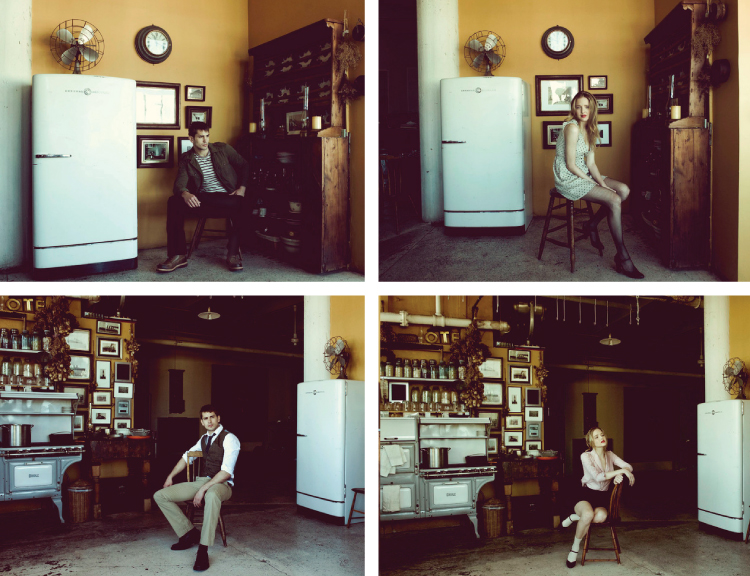
Fischer Clothing
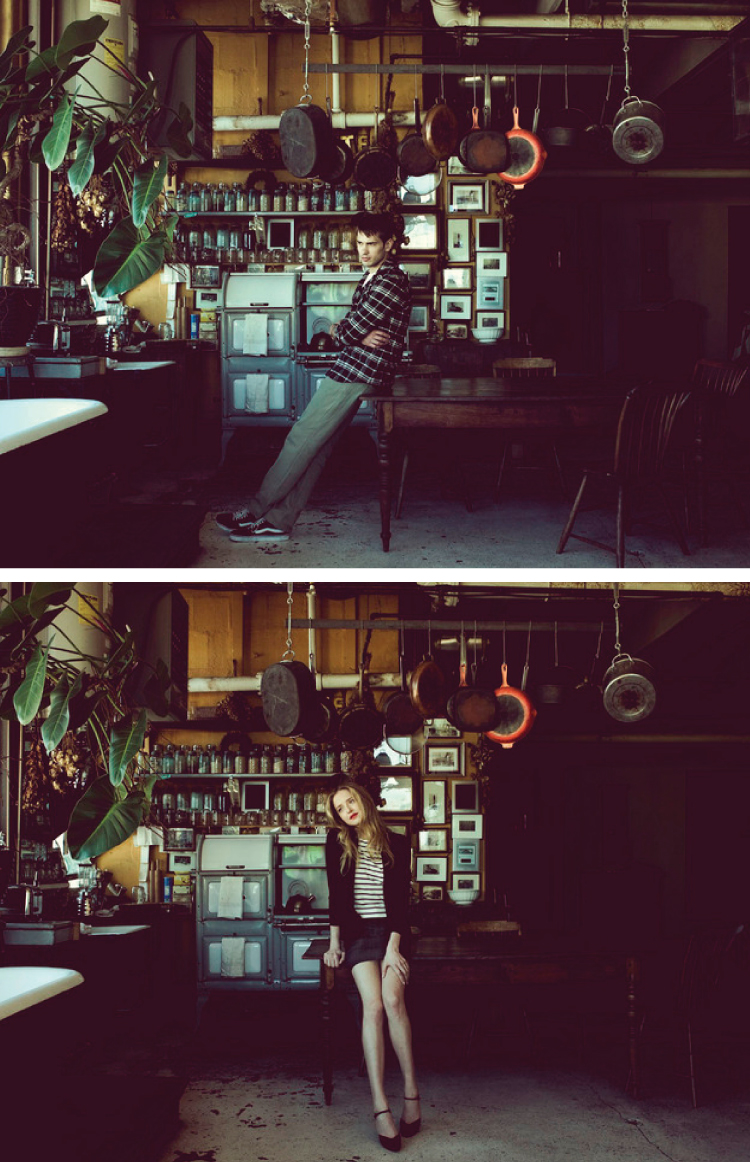
Fischer Clothing
These images from Fischer clothing are breathtaking. The entire photograph is so thoughtful and moody and I love how they use the same space to take a female version and a male version for the catalog. Aren't the colors gorgeous? The stylist did such a nice job of keeping everything rich and monotone but then adding subtle pops of color (like the red frying pan above). Genius. And the clothes are so lovely.
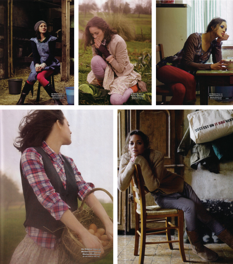
Marion Cotillard in French Elle
And finally, I wanted to share these completely charming photographs that I've had saved for some time of the stunning Marion Cottilard for French Elle. The styling is subtle and easy but the set as a whole—her hair, clothes, props, posing—is just beautiful.
Related Posts Plugin for WordPress, Blogger...