Thursday, March 31, 2011

Lived In

When I picture my dream house, it's never a stark, white, clean-lined space of modernity—it always features exposed brick and old, worn furnishings and potted plants and deep, rich colors. Sure I consider flings with white rooms or bright, bold spaces or even a concrete and glass waterfront property, but time and time again, I crawl back to my first love. These rooms just feel so right to me: so comfortable and calm and nostalgic. Do you have a style you are constantly drawn to? Is it represented in your current space?
Lived In (1)
Lived In (2)
Lived In (3)
Lived In (4)
Lived In (5)
Ugh. It's all so lovely!
images from top left and in rows: kitchen pantry // blue bedroom wall // brick wall + floral lampshades // leather chair // old mirror // living room + leather furniture // wood dresser // spiral staircase // blue dining room door // blue-green desk // grey hutch // cubbies // piano // stone kitchen1 // stone kitchen2 // stone kitchen3 // theater posters // map wall // turquoise bookshelves // blue cabinet

Wednesday, March 30, 2011

Arnold Eagle + the MCNY Collection

The Museum of the City of New York sounds like a magical and wonderful place doesn't it? I wish I would've visited when I was in NYC a few years back but to be honest with you, I didn't even realize it existed. (But now we all do and we won't make that mistake again.) Browsing their website I was particularly interested in an exhibit by Arnold Eagle titled "One-Third of a Nation". He was part of the WPA in the late 1930's and this particular collection documents poverty in New York during the Depression. It's probably inappropriate to tell you to "enjoy" these images, but I think you'll be intrigued by them as I was.
Arnold Eagle (1)
Arnold Eagle (2)
Arnold Eagle (3)
Arnold Eagle (4)

Tuesday, March 29, 2011

The Art + Home of Tove Mauritzson

Tove Mauritzson is a fabulous Swedish artist with a fabulous Swedish home. Her art is a bit over-the-top for my taste generally but I think paired with her perfect amount of bright and light house the whole thing makes my heart skip a beat.
Tove Mauritzson (1)
Tove Mauritzson (2)
Tove Mauritzson (3)
Images are from mixr (via a new favorite: the diversion project) and Tove's website.

Monday, March 28, 2011

Circus + Carnival + Katy

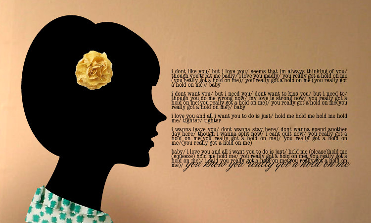
First off, please take note that although I could've easily spelled "circus" and "carnival" with a "k" so that everything would match, I refrained. I've never understood the need to do that. I lived in a tiny town in Wisconsin and there was a little diner called the "koffee kup". Why?! They both already start with the same letter! I think it'll irritate forever and ever. Ok, let's move on...
//////////////
I got to work early this morning (I know, it's a miracle. Especially with my reliance on public transportation. Back to the story.). I not only had time to get a coffee but I had to time to stop into the Newstand. I'd never been so I didn't know what to expect— I thought it'd be a handful of magazines and a cooler of drinks. Boy was I wrong. I literally caught my breath when I stepped into the shop. Magazines as far as the eye can see! Since I'm obsessed with magazines, I was giddy. Let me say though, magazines in Australia are about three times as expensive as magazines at home, so I've had to reign myself in. But today I was determined to buy and ended up with British Country Living (with bonus issue!), British Glamour and American Elle got me at the check-out because it had the lovely Katy Perry on the cover and was a special price of $5.95. This is a long story to say that the photoshoot of Ms Perry (or Mrs. Brand rather) is really lovely and what I'm showing you today. The stylist was Joe Zee (remember him from "The City"?) and was photographed by Carter Smith. I'm not sure whose brilliant idea it was to have it circus themed but I think the whole thing is gorgeous. What do you think?
Circus / Carnival / Katy
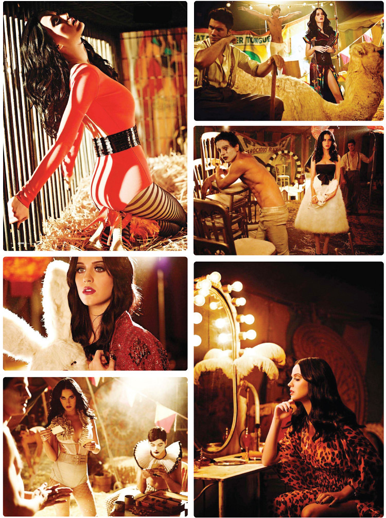
Stunning right? I searched and searched for the "outtakes" but they either haven't made it to the internet yet or they only took ten photographs because I couldn't find any at all. They'll probably turn up just as soon as I stop looking...
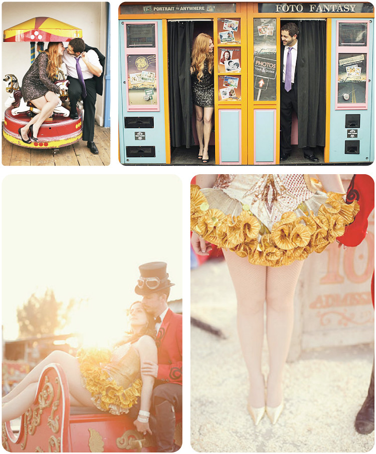
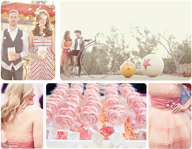
I thought this was the perfect opportunity to share some wedding/engagement pictures of circus/carnival themed shoots that I've been sitting on for a bit. It's a really fun concept don't you think?
Circus / Carnival / Katy
images: carousel + photo booth // gold skirt + popcorn + bike // pink dress + heart tattoo + lollipops

Friday, March 25, 2011

Listen To This: She + Him

Who doesn't love Zooey Deschanel? Obviously we all do because she's adorable. And if we don't all love M. Ward we're about to. Together they make up She + Him and they're absolutely delightful. Here are the two of them covering The Miracles 1962 classic "You Really Got A Hold On Me". It's charming and melancholy and a great ease into the weekend.

(she + him // you really got a hold on me)
Gorgeous. And in case you missed it, Zooey has a fun little Tumblr you should be visiting.
Now. I have a confession to make: this is recycled. Two Valentine's ago I did a week of designs for my design blog that were inspired by different songs. It's been a busy week and I didn't have time to create something brand new, but this is still my original work and it's still a gift to you. So. I hope you love it.
She + Him: You Really Got A Hold On Me
Best of weekends to you my dears!

Thursday, March 24, 2011

Pack Your Bags — Het Hemelrijck

Who wants to go to a charming bed and breakfast in Rotterdam? Me too! I love the pretty pink cupboards and that chandelier and the ridiculously steep staircase (don't worry, according to their site they'll carry your bags upstairs for you. Cute.). Looks so relaxing doesn't it? Just what we need...
Het Hemelrijck Bed + Breakfast
Is that a mimosa? I'm booking a room now.

Wednesday, March 23, 2011

Pretty Produce

I love to see unexpected elements in floral arrangements. I remember the first time I saw an artichoke peeking it's little head out of a bouquet of flowers—I fell immediately in love. Since then I've seen asparagus and heirloom tomatoes and unripened blackberries (can you imagine what a mess a ripened blackberry would make on a wedding dress? Eek!)... They are all so whimsical and lovely and surprisingly elegant. You'll see...
Pretty Produce (1)
Pretty Produce (2)
Pretty Produce (3)
Pretty Produce (4)
They're all so lovely and charming. Oh, and delicious...
images from: poppies and posies // ever after florals // oh happy day // this is glamorous // the painted primrose // wedding savvy // studio blush

Tuesday, March 22, 2011

Proud Parents

There is nothing better than a good family photo (and nothing worse than a bad one...). We all have family photos that we adore so I thought I'd share a few fun ways to display them.
Family Photo Displays (1)
Family Photo Displays (2)
Family Photo Displays (3)
I love the photos stuck directly to the wall and the huge blown-up photographs (how amazing is that black and white image of the three little girls?!). I also really love the idea of a collage in an unexpected place—like the bathroom.
images (from top left): shelves // baby over the fireplace // with laurel wreath // living room wall // mural // collage over the bed // little girls with birds on their head over the sink // table // hallway and shelves // collage over fireplace // over the couch // hallway with black frames // over the twin beds // closeup of collage over fireplace // kitchen nook // bathroom

Ok, one last thing for today. While searching through some inspiration images I've collected I found some beautiful photographs taken by a father of his two sweet little girls. He's created a "photo blog" of them (Kayla + Kristin). They so clearly adore each other. Any of these pictures would be amazing as art in their home, don't you think?
Kristin and Kayla (JWL Photography)
I'm completely smitten with the image above of the two of them at sunset. So stinkin' cute! See you tomorrow my dears.

Monday, March 21, 2011

Meet: Christopher Stott

I am always so impressed by fine artists. And I'm doubly impressed by photo-realist fine artists— people like Christopher Stott. His paintings are incredibly life-like but you can tell that they're not photographs, which is a very important element (to me) with photo-realism artists. I still want to see the hand of the artist in the work.
Christopher Stott (1)
Christopher Stott (2)

Visit his blog and website. (Thanks to Uppercase for introducing us and a big "yay" to Christopher for his Anthropologie commission!)

Friday, March 18, 2011

Listen To This: Nickel Creek

There's something about bluegrass that I find so endearing and nostalgic. I don't claim to be any sort of musical intellectual, particularly in this genre, but I think Nickel Creek does an amazing job with their songwriting and presentation. Give it a go...

(nickel creek // jealous of the moon)
So lovely right? (Generally I'd try to find a better quality audio version, but I think a little static noise in this case is charming.)
And in our grand tradition, here's something I've designed for you.
Nickel Creek: Jealous of the Moon
PS. This amazing 1920's picture is from Flickr member "photo_history" check out the original and her photostream. Great stuff. Happy weekend-ing my dears!

Thursday, March 17, 2011

All the Buildings in New York

When James Gulliver Hancock moved to NYC a year-ish ago, he decided to start drawing "all the buildings in New York". You gotta love a lofty goal. Now I'm not sure if that means that he's really trying to draw every gorgeous building or if it more implies that he's just going to keep on keepin on until he's bored (perish the thought!). I've always enjoyed drawings of the exteriors of buildings and New York is just so full of fabulous architecture that this project was destined to intrigue me. You're going to enjoy it I'm certain.
James Gulliver Hancock (1)
James Gulliver Hancock (2)
James Gulliver Hancock (3)
Good news! You can purchase any of his drawings (that's right any!). Visit his blog and his website. And thanks to the design files for introducing me to this project.

Wednesday, March 16, 2011

Apples + Oranges

I'm generally attracted to a neutral room but lately I've been drawn to bright colors. As I started going through my inspiration folders I realized that I've been collecting an awful lot of orange and green rooms. These spaces are so lively and friendly and unique. How do you feel about the use of vivid colors in your own home?Apples and Oranges (1)
Apples and Oranges (2)
Apples and Oranges (3)
Man I love the bright apple green especially, although I would absolutely adore any of the upholstered orange pieces. It'd be very difficult to be gloomy in such sunny spaces!
images (from top and across): green + white living room// orange shelf // orange art installation // green bedroom // orange living room // orange chairs + red sofa // green tile // green dishes // orange wall + white shelves // green headboard // orange + fireplace // butterfly cabinet // orange headboard // green framed art // green kitchen + 16 // orange dining // green floral wallpaper

Tuesday, March 15, 2011

Meet: Johnny Miller

Johnny Miller is another one of those "behind the lens" artists that I knew but didn't know. In other words I've seen (and admired) his work for years, even to the point of ripping his images out of magazines for my massive "inspiration" folders, but didn't know his name. He's done work for Martha Stewart, Kate Spade, Target, Chronicle Books, Real Simple, Blueprint (rest in peace darling) and on and on. So much inspiration in his portfolio!
Johnny Miller (1)
Johnny Miller (2)
Johnny Miller (3)
Johnny Miller (4)
All images are from his portfolio site. Visit!

Monday, March 14, 2011

Take A Seat

I often get suggestions on what to blog about (mostly because I whine "I don't know what to blogggggg abouuuuuuuuut" and those around me offer input to stop the noise. [PS. Thanks!]). That said, I was with a friend today and we were talking about wedding details (as two unengaged ladies often will) and we got on the topic of seating charts and escort cards. I don't think she actually said "you should blog about that", but I was happy for the unintentional suggestion. And so are you because there are some good ones in this collection. Are you planning anything that needs a seating chart or place cards? I've always thought a fancy dinner party (or even a not-so-fancy dinner party) would feel even more special with seating cards. Maybe one day soon...
Take a Seat (1)
Take a Seat (2)
Take a Seat (3)
Take a Seat (4)
images (from top): keys // produce boxes // ladder // envelopes // grass // vintage valentines // chalkboard // buttons // doilies // string // library drawer // circles + pins // personalized pins // tall chart // corkboard on easels // fabric topped + clothespins // chart (with bike) // vintage travel postcards // corks // birds perched on glasses // corkboard // window // tags + clothespins + trinkets

Friday, March 11, 2011

Listen To This: Louis and the Hunt

Remember a couple of months ago when I encouraged you to listen to the band Scattered Trees? Well, I have another strong suggestion: Louis and the Hunt. What do they have in common you ask? Well the lovely Ryne is in both bands. And he's such a talented, sweetheart of a guy you've really got to get to know him better. Here's a little interview he did as well as an amazing live version of "Footprints on a Bed".

(louis and the hunt // footprints on a bed)
So good right? There's more good news, you can download this song for free here AND he's just released an EP that is full of great songs. Buy it from iTunes and visit his myspace.
Here's a little artsy interpretation for y'all.
Footprints on a Bed: Louis and the Hunt
Have a fabulous weekend friends!

Thursday, March 10, 2011

Bell Jar Art

I've always loved a jar. Whether it be one of those old time-y jam jars (you know, the ones with the little fruits on them?) or a beautiful turquoise Mason jar or a bell jar. I love that bell jars in particular can transform its contents (no matter how mundane) into a piece of art. When I get a place of my own again I'm definitely going to figure out a place for a bell jar or two. Another great thing about these pieces of art? You can change them easily: pinecones in the winter, a collection of feathers in the fall, a huge artificial magnolia in the spring, a pair of vintage pumps any time of the year... the sky's the limit.
Bell jars (1)
Bell jars (2)
Bell jars (3)
Bell jars (4)
What would you put in your jar? Do you have one? I want that mini trailer in the drawing above in mine. Adorable.
images from: emmas design blogg // sadie olive // apartment therapy // lonny // home shopping spy // houzz // sanctuary // cox + cox // we heart it // the bedlam of beefy // a print a day // the drill hall // remodelista // day

Wednesday, March 9, 2011

Fabulous Thrift

Remember a while back when I talked about the fabulous Red Velvet Store in Springfield, Missouri? Well since that post I've been noticing more and more amazing boutique thrift stores being reported on. It got me thinking about the merchandising challenges of literally constantly revolving stock and I'm in complete awe of the talented group of people that have created the following lovely boutique spaces.
Boutique Thrift (1)
Boutique Thrift (2)
Boutique Thrift (3)
Boutique Thrift (4)
Beautiful right? Maybe I'm just a sucker for 1970s mod wall paper and rows of workboots, but I think these particular shops have really excelled in the design of their fitting rooms and merchandising of men's items. Featured shops: Red Velvet // Brass Razoo // Stock Vintage // Interim Thrift Boutique (Please check out this video that Interim put together explaining their concept. It's really well done and the message is great.)
See you tomorrow my dears!
Related Posts Plugin for WordPress, Blogger...