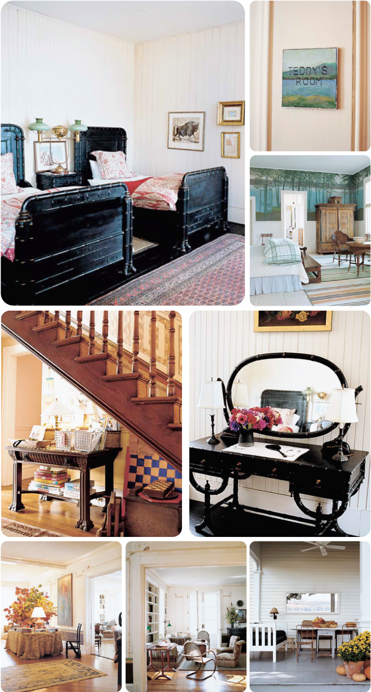
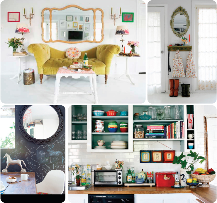
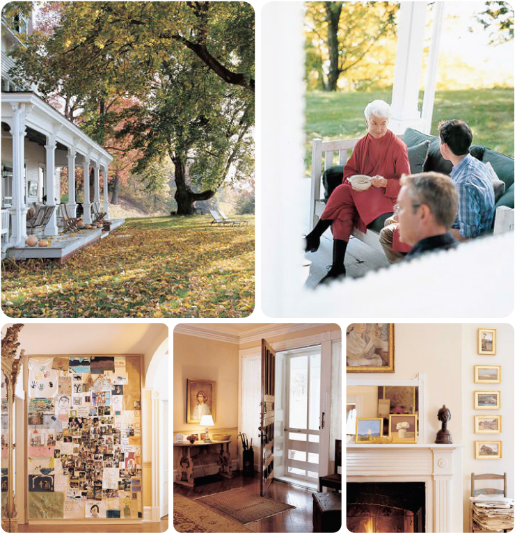
Have you seen The Family Stone? It's this pseudo-Christmas movie that I think is actually quite charming and lovely but a lot of people I know really don't like it. Maybe it's because it's a little dark and heavy for a Holiday film or maybe it's because it has Sarah Jessica Parker in it (people seem to have a really strong opinion of her one way or the other... usually the other). Anyway, I love it. I watch it all year 'round. I think one of the reasons I love it is because of the family house. It's so warm and full and reflects a life devoted to beautiful and creative things. You should see it if for no other reason than the set is inspiring. That said, when I ran across this Hudson Valley home on Martha Stewarts site it really reminded me of the Stone house and I thought you might like to see it.
The owner is the gorgeous white-haired lady in the first row of photos. I love to see the people who live in these spaces - you can attach so much personality to their faces when you look at the rooms they inhabit. She's done a wonderful job of incorporating classical pieces in an eclectic and not-at-all stuffy manner. The house sits on 87 acres and the house looks quite big, so I bet she wouldn't mind company.
All images are from Martha (and there are even a handful more including a charming craft room she made for her twelve grandkids. Lucky kids.)
Thursday, September 29, 2011
Wednesday, September 28, 2011
Loving: Round Barns
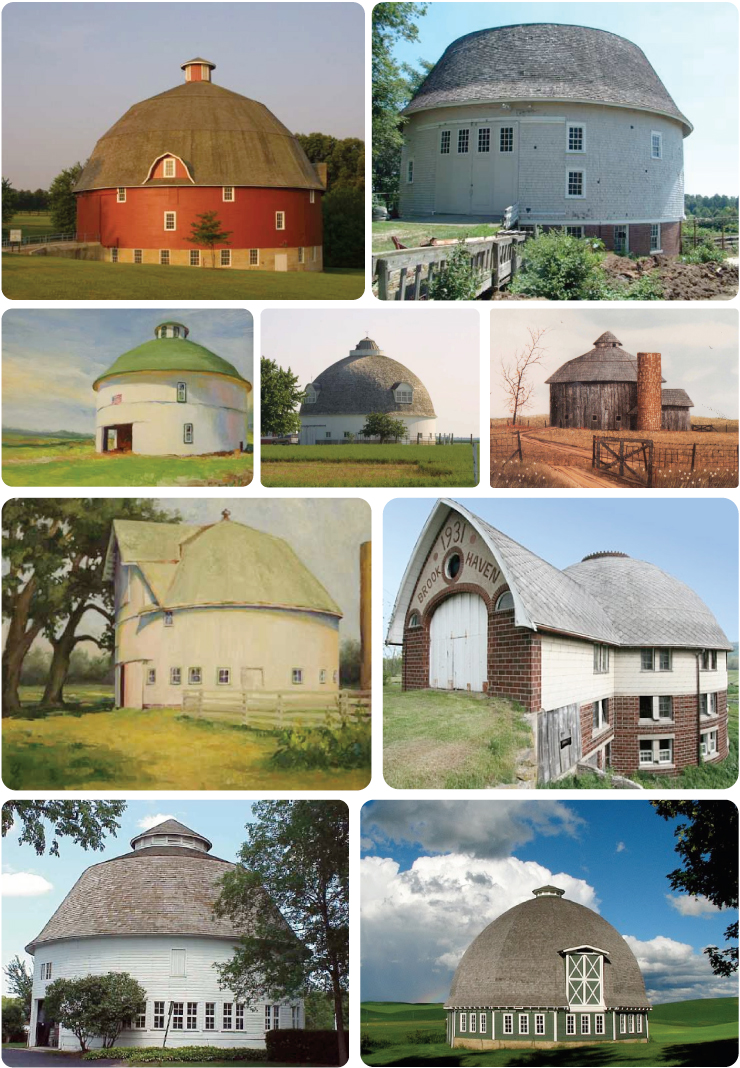
My mom and I drove from Rockford to Oregon, Illinois yesterday. It's been wet the past few days so although we're in Fall and technically everything is dying, the world was spectacularly green and lush. The drive is really lovely - tree lined roads, the river in all of its swollen majesty and some really gorgeous old buildings. Especially the barns. I'm particularly attracted to round barns. Something about them is so whimsical and charming don't you think? It's the circle - circles are definitely the friendliest shape. I've collected some round barns for you -have you ever seen one of these in person? Even the broken down ones are glorious.
images from: westby // ohio barns // gwen gutwein
Thursday, September 22, 2011
Look At This: Handwritten Letter Project
I went to a flea market this past weekend (as an aside, it's a good thing I don't have a million and a half dollars and a huge house because I'd fill it with every awesome vintage thing I loved - which is pretty much all of them - and no one needs that many salt and pepper shakers). Among the couple of things I did come home with was this gorgeous, illustrated souvenir book of the Chicago World's Fair in the 1930s. The watercolor illustrations and few sentences about each exhibit were incentive enough to buy it; but it didn't stop there. On the exterior flap of the book, in traditional "old person" handwriting, the worlds "old" and "save" were written. Looking at that script made me miss every single elderly person I've lost and I felt like (a) any of them would've written that because they knew a cool thing when they saw it and (b) since they all seem to have exactly the same penmanship any of them actually could've written it. Now they probably didn't, but that's the thing about that era of students learning cursive: for some reason, no matter where they were in the US and even abroad from what I can see, they all learned the same style. I don't have the energy to talk about whether or not this was a good thing and what social implications this conveys, but I do have the energy to say that at the very least, that generation knew how to write. They could put pen to the paper without it turning into a giant scribbly mess (well most of them anyway) and they were forced to communicate with each other in a physical as opposed to digital fashion. I'm not going to tell you to write more letters but I will say that your great great grandchildren (or just some random child in the future) will probably be way more excited to find a handwritten note than an email.
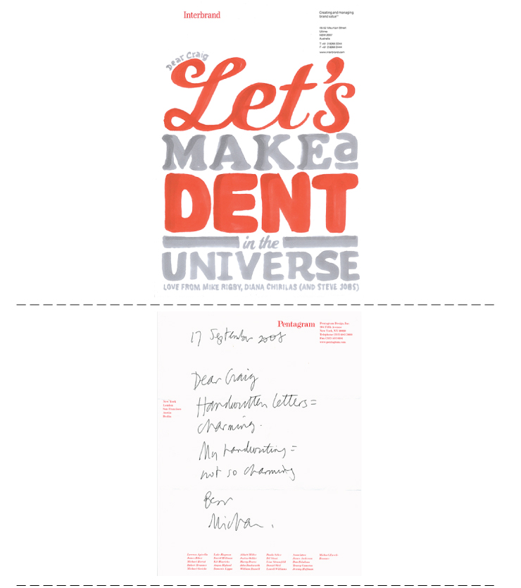
This is not the first time you're hearing this. This is also probably not the first time you've told yourself "self, pen more letters to the people you love". However, this may be the first time you're seeing this "Handwritten Letter Project" in which Craig Oldham invited designers and artist to write him a letter on their own stationery. Some were simply that and others had a little note and a lot of illustration or a note with beautifully hand-rendered type. I'd like to get my hands on a copy of this book to read what people thought worthy of writing and also to see the vast differences in modern penmanship. It's very fascinating to me. Take a peek.
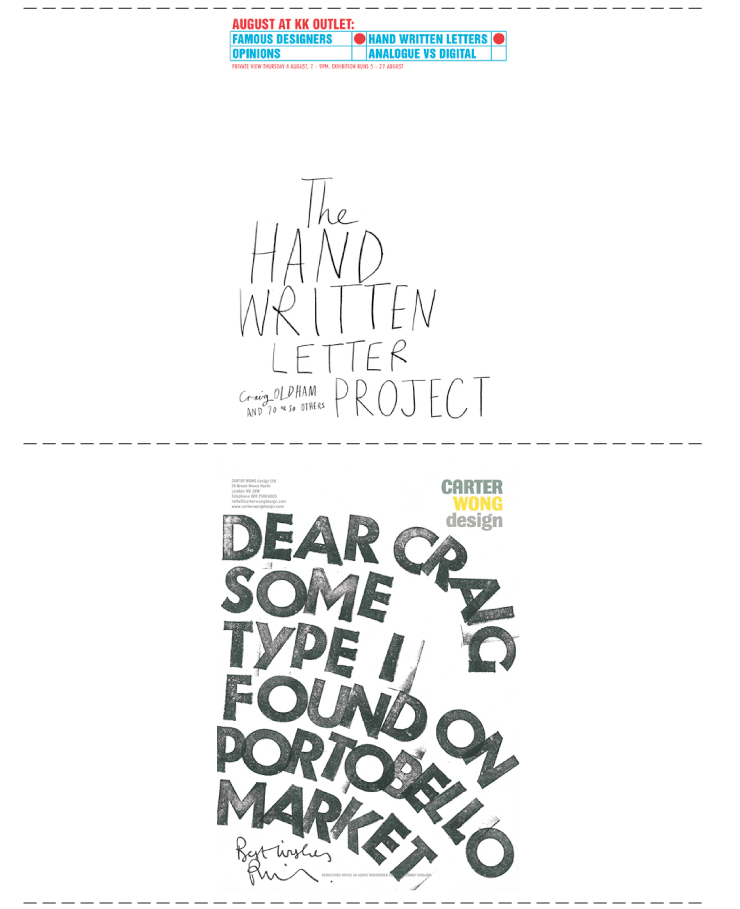
images from the HLP site
This is not the first time you're hearing this. This is also probably not the first time you've told yourself "self, pen more letters to the people you love". However, this may be the first time you're seeing this "Handwritten Letter Project" in which Craig Oldham invited designers and artist to write him a letter on their own stationery. Some were simply that and others had a little note and a lot of illustration or a note with beautifully hand-rendered type. I'd like to get my hands on a copy of this book to read what people thought worthy of writing and also to see the vast differences in modern penmanship. It's very fascinating to me. Take a peek.
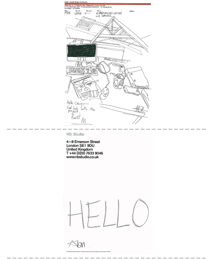
images from the HLP site
Wednesday, September 21, 2011
Pretty Party: Shower Shower
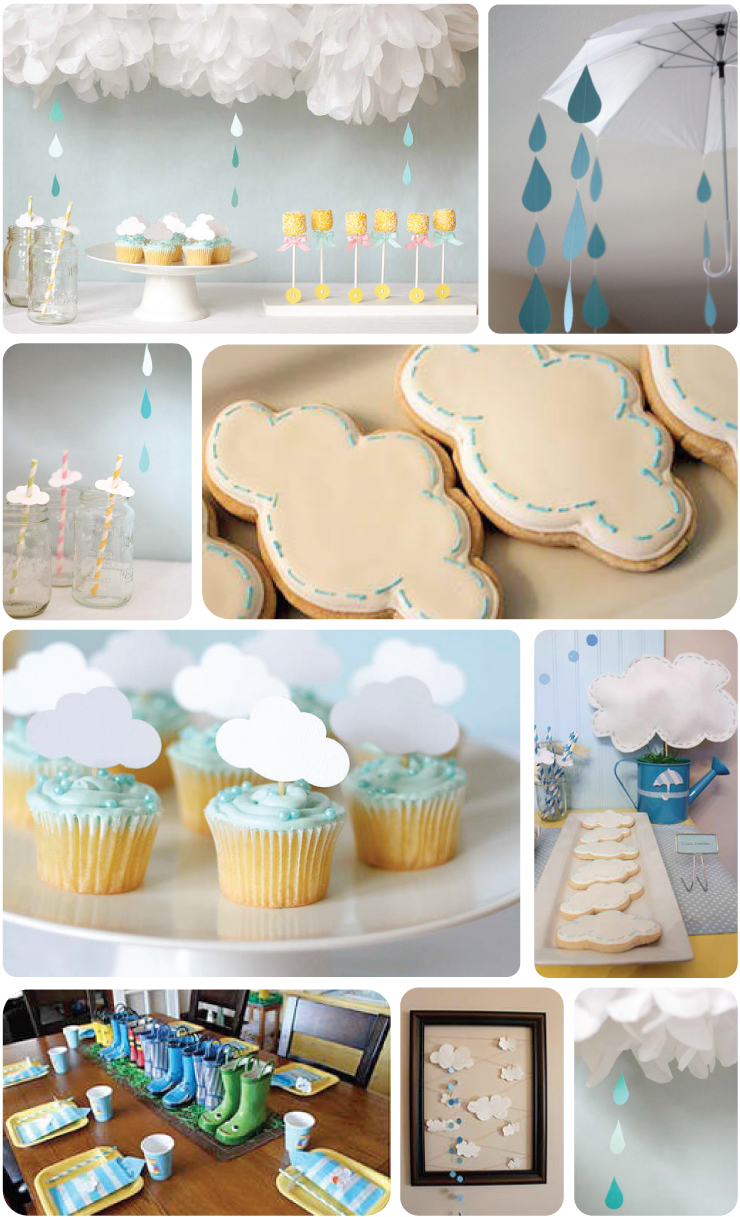
I went to a super sweet baby shower this past Sunday for a super sweet girlfriend of mine. The theme of said shower was pretty much just awesomeness - bunting and delicious nibblies and fruit-infused water served in glass baby bottles (which I'd never seen before—and I've been to my fair share of showers). Now I'm not exactly opposed to "themes" but they have the tendency to get a little out of hand. I've found one though that got me pretty excited. Have you seen this before? A "shower" shower? Isn't it clever? I don't think it's crazy overdone so that's a check in the positive column. What do you think?
image sources: blue + yellow // umbrella + rain // cloud cookies // striped straws // cloud cupcakes // watering can // rain + white pouf // artwork // rainboots
Friday, September 16, 2011
Listen To This: James Vincent McMorrow
I went to a show last night. I've been wanting to for awhile and I was invited by a great friend (with great taste in music) to see a fella that I hadn't ever heard of. The tickets were affordable and I didn't have to drive so I decided to go along. Man am I glad I did. This Irish gentleman has such a great voice and was so lovely to watch and listen to. He has such a mellow sound that I didn't know how it would translate into concert form but with the band and his chitchat it made for a really great (and surprisingly lively) evening. He's currently on his first-ever headlining American tour so check out the cities/dates on his site and go support him. Bring a friend - shows are always better with friends.
james vincent mcmorrow // if i had a boat
Wednesday, September 14, 2011
Moving In: Eclectic Cottage
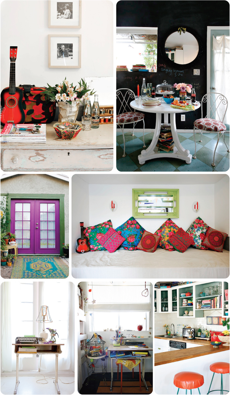
Oh my goodness—this is so great. The perfect mix of light and bright and funky and timeless. Emily Henson (prop stylist extraordinaire!) has done it again. I grabbed this from her recent work but there was no information about what publication it was in or who it belonged to. It was simply titled "eclectic cottage". Do you suppose that means it's up for grabs? If so, I'll take it. And love it forever. (Don't worry, you can visit.)
images from Emily's site. Photographs were taken by John Vincent and Teri Lyn Fisher.
Monday, September 12, 2011
Listen To This: Bandana Splits
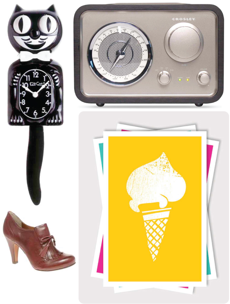
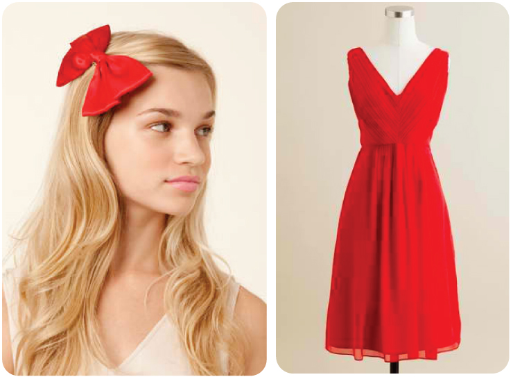
Hello my dear! I hope you had a lovely weekend. The weather was absolutely gorgeous here in Northern Illinois. The air was thick with people realizing it was probably one of the last really warm and sunny days of the season - especially the last weekend day - so there was a lot of loud music being pumped through open car windows. I had to drive a bit to a backyard celebration so I was one of those hooligans (although at one point I drove past an older man reading George W. Bush's biography on his front lawn and I did turn my stereo down - right after he shot me a dirty look. Eek.). These last days of summer make everyone around here giddy and put me in the mood for some retro revival, feel good music. I think I'm still confused on what day it is and I didn't post a music video on Friday so I thought I'd do it today. But since it's Monday and not Friday I'm not doing tweets (@hmdtweets), I've made you a board instead. Yeah!I hope you like it (if you do, go get the album and cruise around town. Quick! Before it starts to snow!)
bandana splits // sometimes
felix clock // retro radio // fringe shoe // gelati print // bow // red dress
bandana splits // sometimes
felix clock // retro radio // fringe shoe // gelati print // bow // red dress
Friday, September 9, 2011
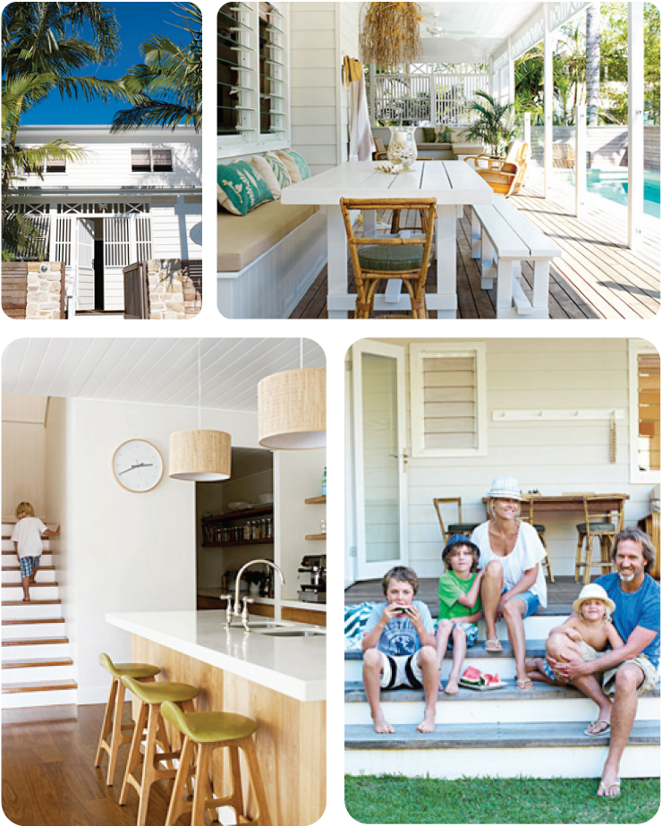
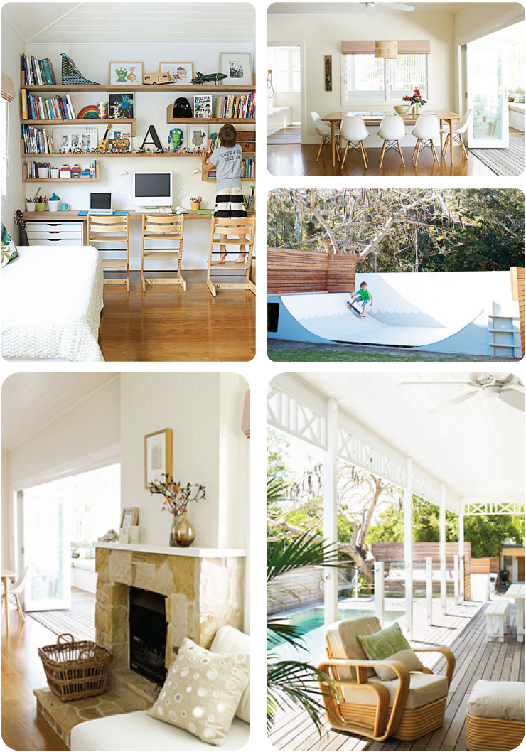
Moving In: Byron Bay
Jeez I love a good beachy house. Even though I can't actually see any beach in these photographs, the lightness and brightness and overall breeziness of this home implies the beach. And it's in Byron Bay (Australia of course) which is gorgeous ocean views everywhere so it must be near the water. It doesn't matter - there's a pool and a sweet porch and, what's that over there? Oh it's just a skate ramp. Coolest parents ever. Enjoy!
images from Inside Out magazine via the style files
Thursday, September 8, 2011
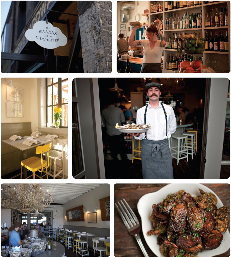
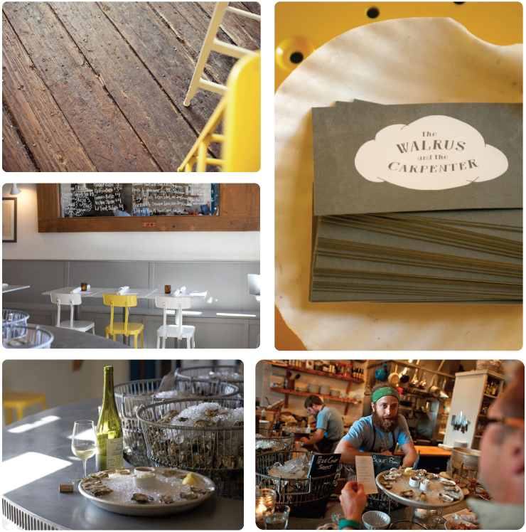
Bon Appetit: The Walrus + The Carpenter
One thing I wish Rockford Illinois had more of is great restaurants. We have a handful but this city of mine hasn't quite mastered the importance of good food and ambiance - it's generally one or the other. Which brings me to the sharing of the Walrus and the Carpenter oyster bar in Seattle. It's the perfect blend of industrial and comfort decor. The grey, white and yellow is super charming.
Now if anything could make me eat an oyster it'd be those yellow stools and that handlebar mustache. All of it is lovely.
images are from stephmodo // w + c site // the new york times
Now if anything could make me eat an oyster it'd be those yellow stools and that handlebar mustache. All of it is lovely.
images are from stephmodo // w + c site // the new york times
Tuesday, September 6, 2011
Look At This: Thao + Mirah On Tour
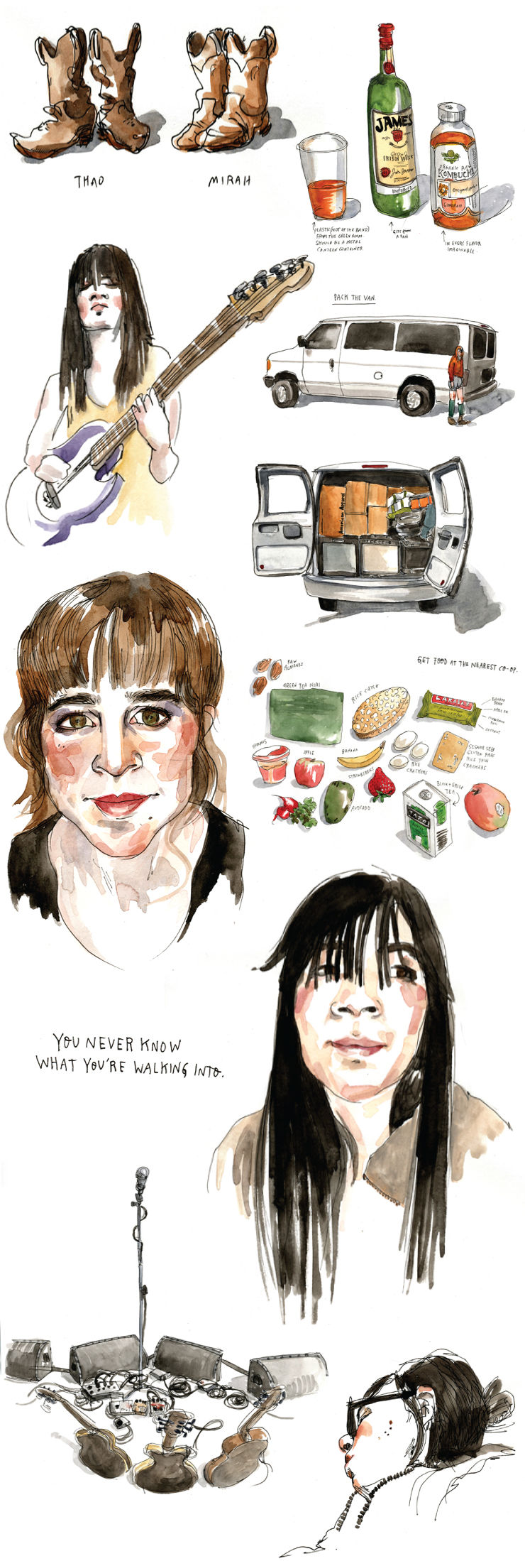
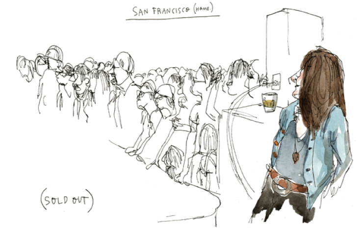
Hello my dear! Did you have a nice long weekend? I always have such a great Labor Day weekend but it makes me a little sad knowing that ice and snow is just around the corner. Since I didn't get to experience any of that last year (and I honestly do enjoy it up until after the first of the year when it just keeps on being freezing and there's no Christmas cheer to warm you) I was able to enjoy the weekend without any of that forlorn. Oh and I spent Sunday with some amazing friends celebrating a marriage so it was even sweeter. The wedding forced me to do a bit of driving—over an hour each way—so I got to spend some time with my ipod. The drive back today was especially fun since I knew where I was going and I didn't have to get back at any particular time, I was able to relax and think about what I wanted to listen to. This got me in the mood to go see a show and when I got home I decided to see who's planning a fall tour near me. Well, The Tallest Man on Earth isn't (although he IS going to be in Brisbane in October) but Thao Nguyen is playing with The Get Down Stay Down in Madison Wisconsin and Chicago Illinois and I'd love to go see them. This leads me to today's share. On Thao's blog she shared this great story that Wendy Macnaughton illustrated showing bits and pieces from a tour that Thao did with Mirah. Wendy's watercolor sketches really tickled me, I think you'll love them too.
here's the whole story
Friday, September 2, 2011
At The Design Blog: September Calendar
Listen To This: Little Dragons
Generally speaking when I'm trying to decide on a song to share with you the video is one of the major factors. Which usually means no live tracks (unless they're still recorded in a studio) and no "fan" videos. Because they're often really bad. Not the case with today's song. This video, which is basically a clip from the movie "Vivre sa Vie" with this gorgeous French woman Anna Karina, feels completely right to me. I hope you enjoy the song and the clip.
little dragon // please turn
This week's tweets were a little sparse, but I'm done traveling for awhile and I've got myself an iPhone (yeah!) so hopefully I'll be better in the coming weeks. Regardless, here they are:
awesome + inspired wedding table decor // interesting VMA moments // go see this movie (I promise it's not as sad as this picture makes it look)
Have a great Labor Day my dear! I'll see you here again on Tuesday! xo
Thursday, September 1, 2011
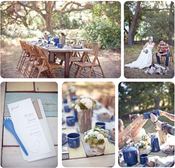
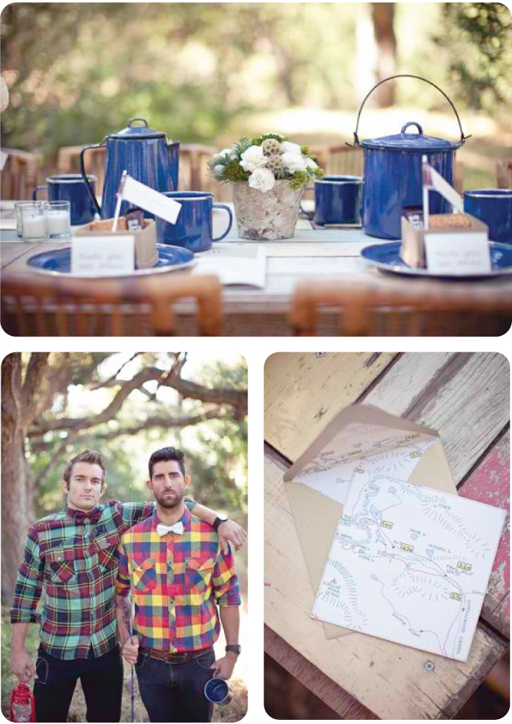
Pretty Party: Camp-Out Wedding
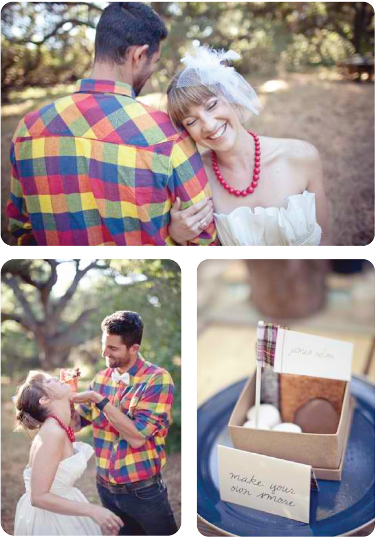
Remember how yesterday I told you all about this weekends massive family camp-out? Well, I'm still in the mood to look at awesome camping inspiration. Which is why I got so excited when I found this delightful camping-inspired wedding shoot. I'm obsessed with his plaid shirt and all the delicious s'more details. Are you doing anything outdoorsy this Labor Day weekend?
images are from elizabeth anne designs and the sweetest occasion
Subscribe to:
Posts (Atom)