
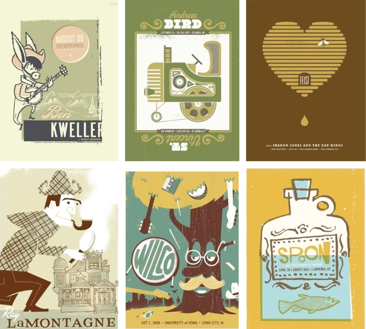
Show posters have always intrigued me. What the heck do they mean? Why would I relate fish jumping out of a bathtub with Wilco? Or Ray Lamontagne with a spooky house and a Sherlock Holmes look-a-like? Well, I wouldn't... Which is also why I love concert posters: the imagination of the designer is allowed to run wild.

(dan stiles) So often gig posters are printed with muted colors so it's nice to see the bold pink, red and blue. I think the little kid on the chair is hilarious—having his temper-tantrum until he gets what he wants.
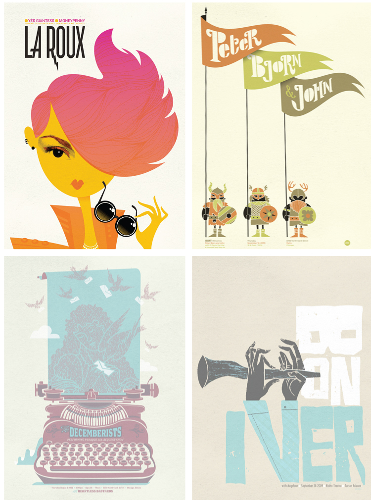
(spike press) I adore that La Roux poster! I've recently become aware of this artist and her hair is such a prominent part of her image, so this poster is a great representation. The Decemberists print does a great job of relaying the romanticism and vintage feel of the band.
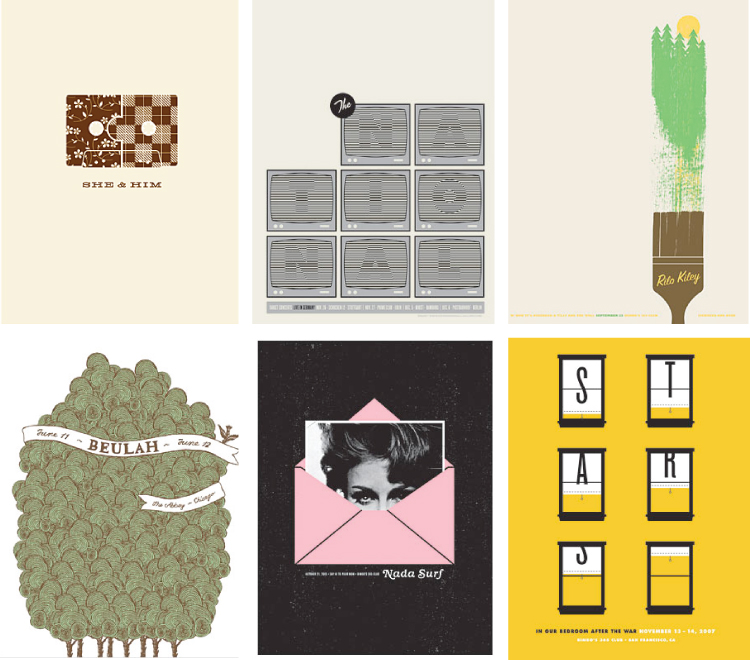
(the small stakes) Jason Munn has consistently been my favorite show poster designer. His designs have a delicate, understated quality to them, yet they're so expressive. The She + Him cassette tape is perfect in its minimalism and is so spot-on with the combo of plaid and retro floral design.
(my associate cornelius) The designs in this portfolio are so unabashedly retro: from the illustrations to the font choices to the overall feel of each piece. I'm particularly intrigued by the Andrew Bird/Tractor and St. Vincent/Projector poster. What a great idea! And you know what? That banjo playing donkey really looks like Ben Kweller... Ok, it's a bit of a stretch but the cheeks are definitely the same.


No comments:
Post a Comment